These past 7 weeks have certainly flown by but I’d be lying if I said that each moment of it was a breeze. While I understand in general how to process graphs and data, it was a learning curve to learn how to be a better researcher when it came to understanding how and why information can be manipulated to tell a biased narrative and of course, how to use tools like Tableau to create compelling, data-driven stories.
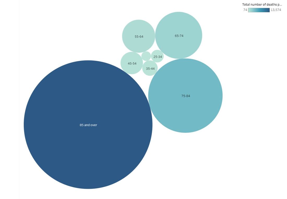
Perhaps the most interesting part of this course for me was learning the various trends through all the different data sets I collected. I collected information on the leading causes of death in the U.S., the number of child marriages per capita on a national level, and how the wage gap can be broken down by sex, race, education level, and occupation. I also learned that data can indeed be beautiful, as indicated by the many, various data story submissions that the Information is Beautiful organization highlights each month. Some of the learning components that stand out to me include being able to identify the most important pieces of information in a data set, how to best represent them, and of course, the importance of pursuing accuracy - all skills that translate well into any job. Though I’ve learned a lot in such a short amount of time, I think I’d be happy if I continue to work in environments where I never have to touch Tableau again. But if I do, at least I’ll have rudimentary knowledge of how to work it :) Now onto my data story… It’s not the happiest topic, but I wanted to cover what the primary health-related causes of death were among those 15 and older in the United States across 2016 and 2017. The information I gathered was provided by the CDC. There were three main areas I studied - the number of deaths in both 2016 and 2017 by disease, age range, and sex and race. (If anyone wishes to see an Excel spreadsheet of my data, it is provided here: cdc_2016_and_2017_mortality_in_the_us.xlsx Of course, CDC provided much more information than these three areas, but for the sake of simplicity, I wanted to focus on the key points that I did. Although the information was pulled from a study that covered just two years, we can identify the diseases and specific demographics we need to focus on in hopes of lessening the impact of serious conditions like Alzheimer’s, either through healthier living and/or improved access to care. Please peruse my Tableau data below to view the full data story, or use the link here to go to Tableau Public directly: https://public.tableau.com/views/Module7FinalProject/U_S_MortalityRates2016and2017?:embed=y&:display_count=yes&publish=yes&:origin=viz_share_link 
0 Comments
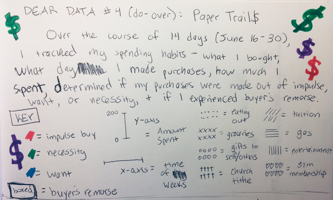 I used the data I collected between June 16 and today, June 30, which included:
The one other data point I would’ve liked to track but wasn’t sure how to go about it was determining what times of the day I made purchases. But to be honest, I personally don’t see any trends as far as what time of day I make purchases. Most of my purchases, especially for groceries and gas, are made during the work day during my breaks. Many of my eating out spending happens around dinnertime when I’m done with work for the day. Though it would’ve made for more interesting data, I don’t typically make a lot of late-night impulse buys! 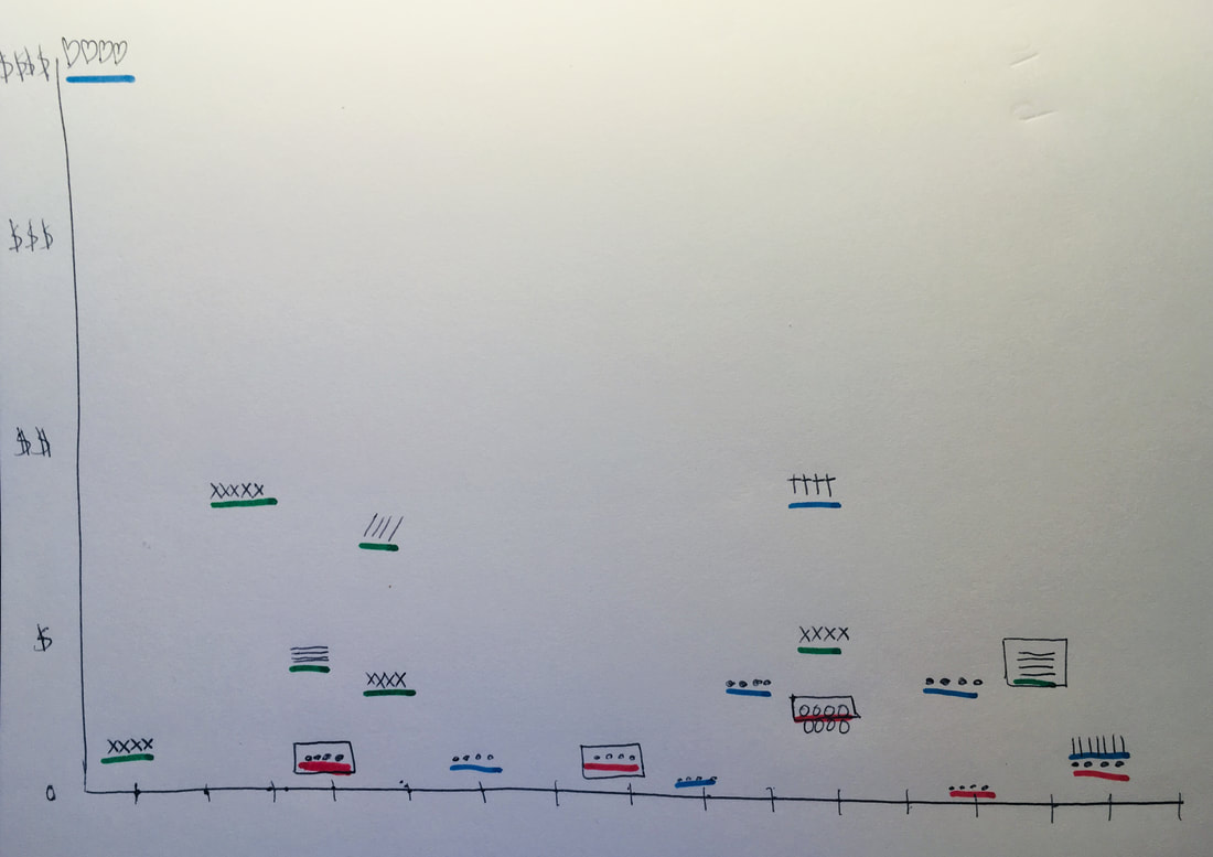 Note: Where there is a lack of data in parts of the chart indicates days I made no purchases.
Here are some trends I noticed:
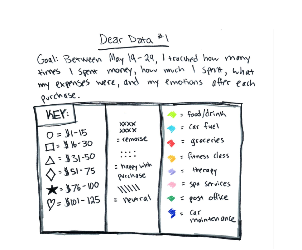
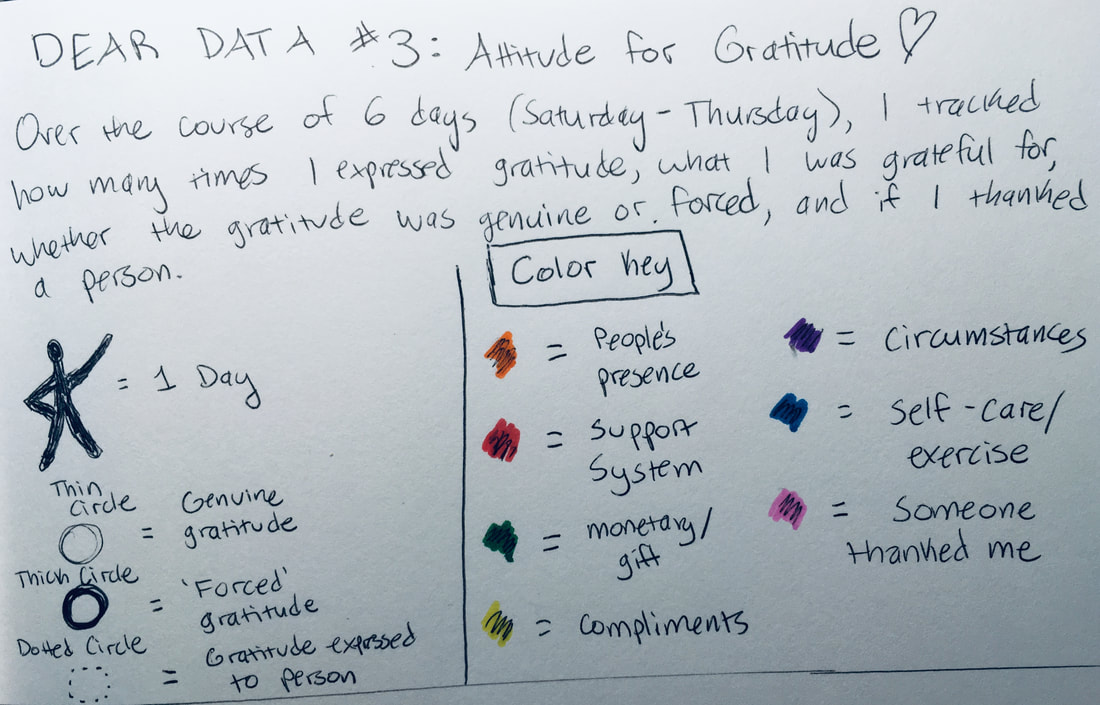 This particular data set was inspired by an experiment I participated in after reading the book “Gratitude Daily: 21 Days to More Joy and Less Stress” by Nataly Kogan. At that time (and even now), I had been going through a rough patch and found it challenging to be actively thankful. And during this time, I spent 21 days recording what I was grateful for and challenging myself to come up with at least three things for each day. This time around, I conducted a similar experiment over the course of 6 days (Saturday, June 22 to Thursday, June 27). I took note of the following data points:
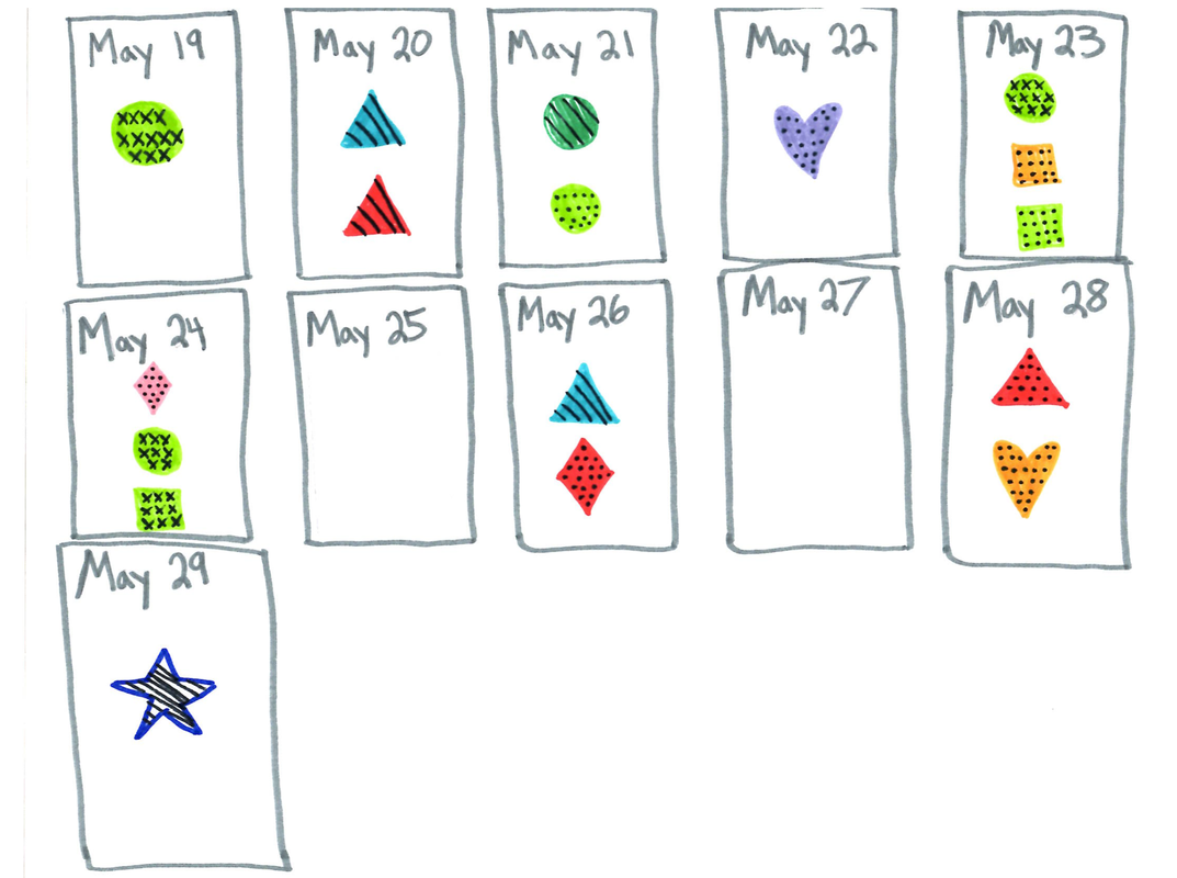
I chose the following design for my Dear Data visual because it encompasses the things that bring me joy (dancing, organization, and beautiful colors) and gives readers relatively simple insight into my data without having to read and reread my key and chart to understand it.  I messed up on the coloring for Day 2 and didn't have whiteout! I noticed that the majority of the gratitude I expressed over the six days was genuine (as opposed to stemming from a place of reluctant thankfulness) and most of the things I was grateful for were related to my family and support system. But at least three times in the past week, my gratitude came as a response to circumstances. In other words, my gratitude was a result of good things happening to and for me rather than a result of me being actively grateful. I also partook in very few self-care forms of gratitude (but that’s to be expected during the work week).
I also feel that I need to do a better job of identifying when someone is grateful for something I have done for them. It could be that the people in my life are more grateful for my presence than I realize, but I might focus on the negative things in my life versus the positive. This particular Dear Data project was an interesting experiment because it forced me to identify positive areas in my life that I tend to ignore. I’m sure that with more gratitude practice, my recorded instances of gratitude will be more plentiful!  An effective data set will not only tell readers what the numbers are, but will incite action. That action could be putting more funding into a particular program or initiative or convincing a potential buyer to be a long-term client. According to Scott Berinato, author of “Good Charts: The HBR Guide to Making Smarter, More Persuasive Data Visualizations,” the art of persuasion is comprised of three specific elements that are used to influence behavior: economic, social, and environmental strategies. For example, a chart comprised of data that applies to a specific geographic region will likely be more compelling and convincing to those that live within that area. Additionally, persuasion in information design involves focusing on the main idea at hand, enhancing it, and adjusting the information surrounding it so that the focus is emphasized. Rather than creating a graph that shows how much a university’s enrollment numbers have dipped over the course of a decade, a more persuasive data visual would indicate that steeper tuition costs are a big factor in the decreased enrollment. “When you have a point of view, you can employ techniques - manipulations - to heighten the effect. The unconscious cues - color, contrast, space, words, what you show, and as crucially, what you leave out - all work to make the idea more accessible and increase the chart’s persuasiveness,” Berinato writes. “Persuasion doesn’t need to veer into blatant editorializing” (Berinato, p. 136-137). Manipulation, on the other hand, is purposeful handling of the facts at hand with the intention to represent untruths as facts. One of the best ways to persuade an audience without using trickery is by challenging oneself to convince their audience of a certain fact or trend, rather than asking what it is that they want to show (Berinato, p. 140). I think one of the most effective things we can do to avoid veering into manipulation territory is to provide context with the information we are sharing. It’s important to be vigilant in determining that the sources our information is coming from are accurate, reputable, and not doctored in any way. So often when I see an Onion article on Facebook, I’m amazed by the sheer number of people that believe the ‘article’ to be factual. This is why it’s crucial to be sure we can rely on the sources we use. It’s also important to identify any factors that might make the data sway in one direction or another. Your job as a data visual designer is to tell a story. Therefore, you cannot leave the most important details out. For example, if I were to show how much women comprise the workforce compared to men but neglect to indicate that the numbers I gathered were from 1942 (the time in which many women took up the positions vacated by men who served in WWII), I would be doing a disservice to myself and my audience. Or if I were to break down the racial diversity in a company located in a region where there is very little diversity in the first place, my data would potentially make the company seem behind the times. And perhaps most importantly, the information cannot be shared with an intended bias. If your intent is to show the percentage of people who regret getting married, it would be a bad practice to only take polls of those you already know are divorced. You’d serve your audience far better by questioning couples/former couples in various stages of relationships, ages, life experiences, jobs, etc. Last week, I shared a data set that explored the percentage of 15-to-17-year-old young adults in the U.S. that were married in 2014 (data provided below). 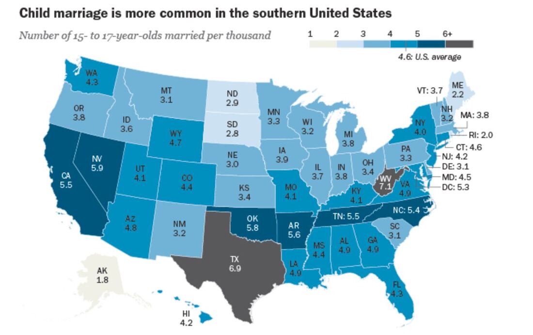 I’d need to do more research on the topic, but a persuasive way I might go about this information would be sharing how the highest number of child marriages seem to occur a) in more Southern regions, and b) in states that enjoy higher populations than average. In states where there are more people, it could be that there would be more young adults of 15 to 17 inclined to get married. In less populated areas like Alaska and the Dakotas, it’s not terribly surprising that there are less instances of child marriages.
If I were to manipulate the data, I might reorganize the information presented in a way that makes it appear that ALL the marriages were non-consensual, or fail to use a similar data set from a different time frame that would show changing attitudes and trends towards young marriages. 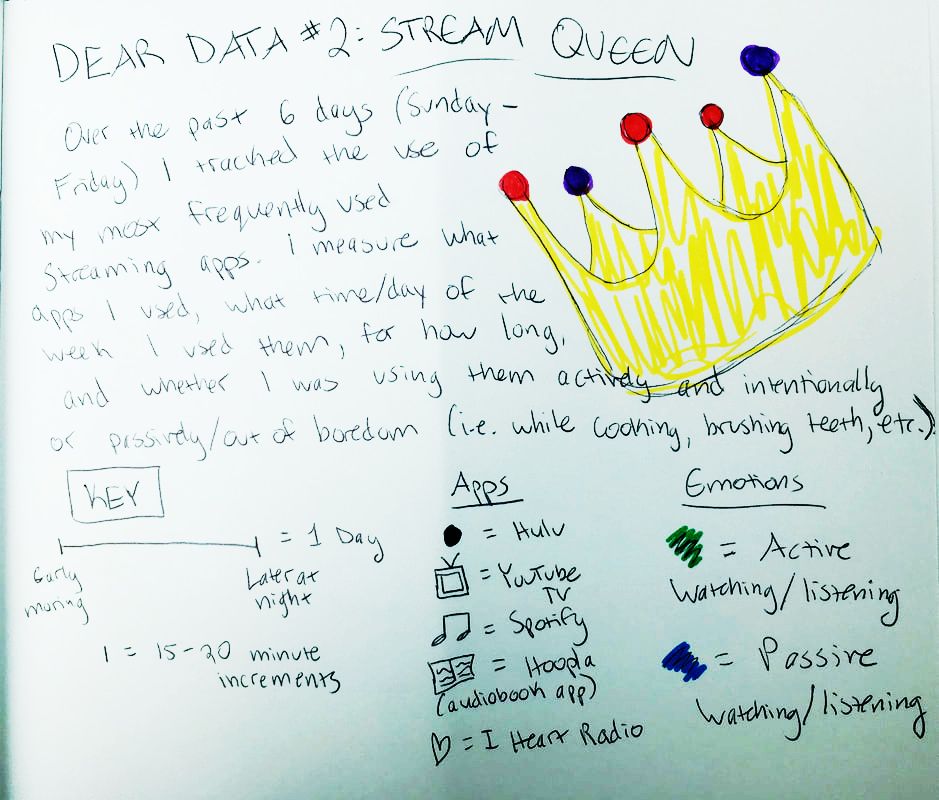 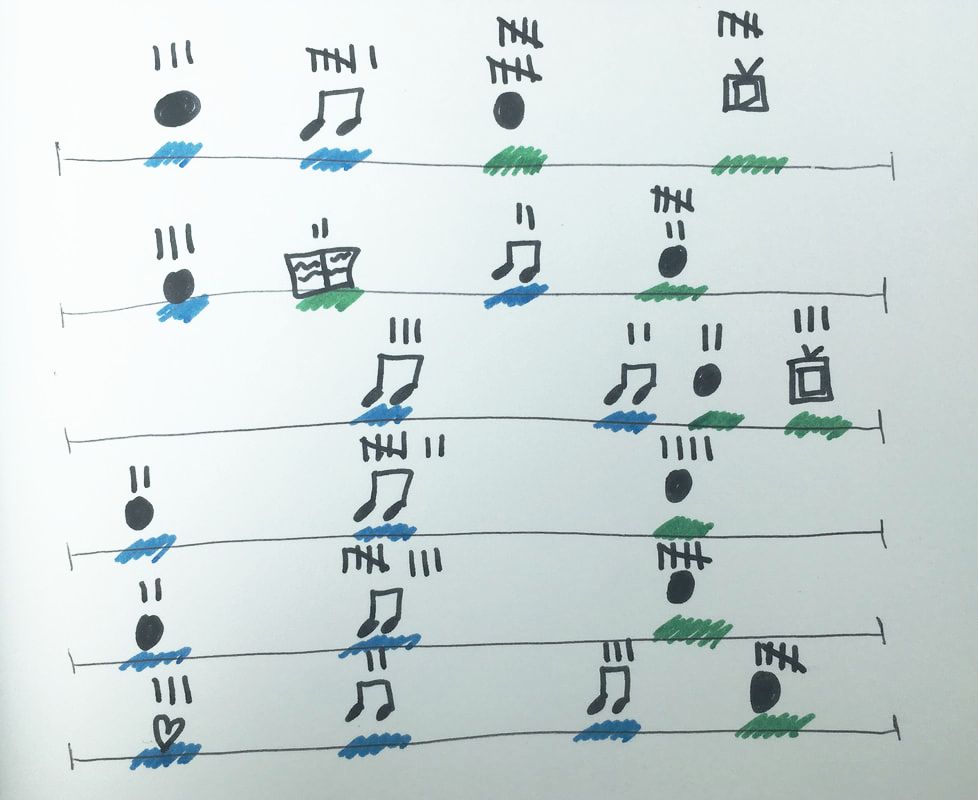 For this Dear Data project, I decided to take a closer look at how much time I spent using my favorite streaming apps over the course of six days: Hulu, YouTube TV, Spotify, I Heart Radio, and Hoopla Digital (since discovering that my Spotify Premium account is bundled with a basic Hulu plan, I’ve been neglecting Netflix).
I should point out that this week was kind of a one-off…I had a particularly hard week, so I spent more time mindlessly watching TV shows than usual. I promise I usually spend 5+ hours each week listening to audiobooks =) Some immediate trends that I notice are that I spend far more of my streaming time passively watching/listening to shows than I do actively. This isn’t a surprise to me, as I always like to have white noise when I’m going about everyday activities. The data probably makes it look like I’m a TV addict, but I suppose it’s just an automatic ‘need’ for me to have something going on in the background. I use Hulu the most often for this; I only use YouTube TV when I’m with other people who have an account with this service. I tend to use Spotify fairly frequently when I’m at work or commuting to and from the office. My use of Spotify at work ebbs and flows; there are some projects I work on that require my full attention (so I can’t risk being distracted by music) while other times, I have more flexibility to listen to my favorite jams. My use of Hoopla Digital was almost non-existent this week. I think I just happened to come across an audiobook that just didn’t capture my interest, so I stopped listening to it altogether. I use the I Heart Radio app when I’m out of range for a radio show I enjoy listening to pretty regularly. I didn’t prioritize that radio show for most of the week, however. I find it a little concerning that the majority of my stream time was spent passively watching and listening to TV shows. I often treat my video streaming apps more like podcasts since I don’t always have my eyes focused on them. I don’t what this says about me and my need for distraction, but my eyes are certainly open to the fact that this could be a real problem.  I don’t consider myself a “math person,” but with a careful eye, I can differentiate between a good graph and a not-so-great one. 1. Take, for example, the following pie chart listed on “WTF Visualizations,” a collection of data visualizations that meant to inform audiences but didn’t quite deliver. 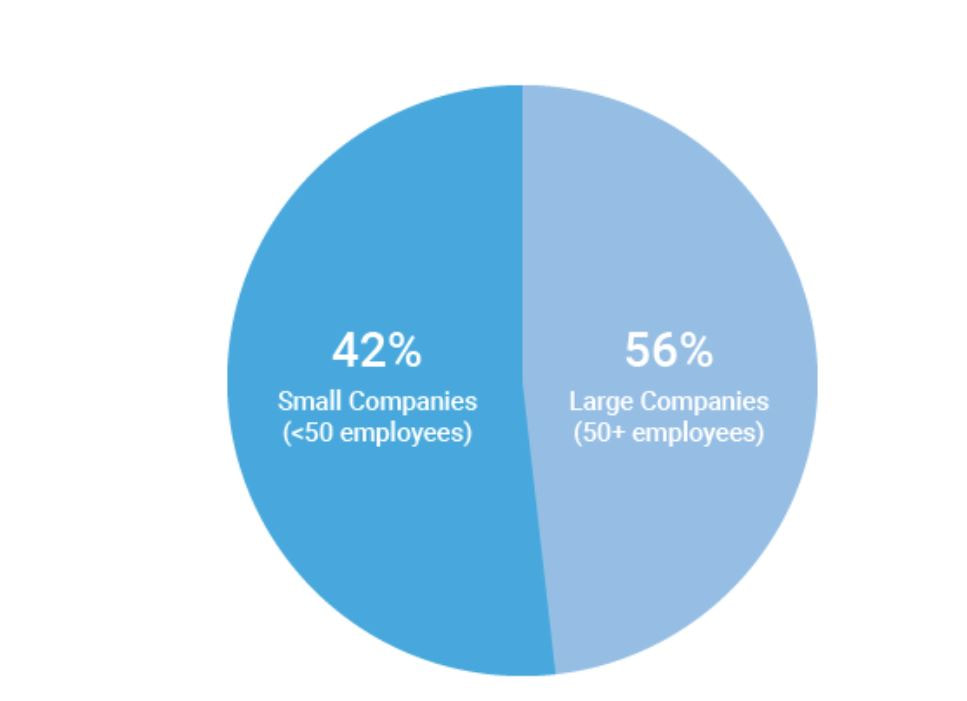 At my workplace, I’m responsible for reporting on human resources trends, employment laws, and best practices on behalf of one of our clients. That being said, I find data and statistics related to these topics fascinating but with this particular chart, I can’t tell what I’m supposed to be gleaning, information-wise. Are U.S. companies mostly large companies at 56% while small companies comprise 42% of national businesses? Or do these numbers apply to a specific state or region? Or are 56% of U.S. workers employed at large companies while 42% work at smaller businesses? Not to mention, 42 and 56 does not add up to 100, nor should 42% represent a bigger slice of the pie than 56%. A common problem when it comes to chart creation, is clutter, according to Tableau experts. The bigger problem in this case is the lack of context – there’s not enough information to generate clutter! The creators of this pie chart would’ve done well to follow the advice of “Steal Like an Artist” author Austin Kleon (it’s a great little book, by the way). Kleon’s advice is to glean inspiration from great creators (or in this case, visualizations), and replicate some of the strategies that would fit well into one’s own creation. The following visual from the Virginia-based Small Business & Entrepreneurship Council shows a bit more information than the pie chart above, and utilizes creative ways to outline data related to women-owned businesses: 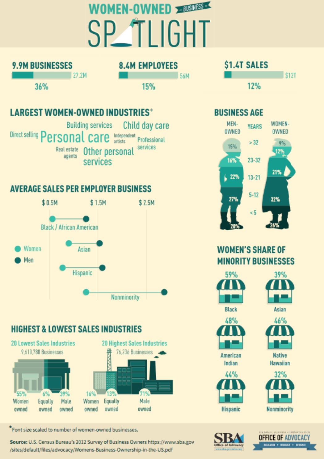 Here, we’re at least given context as to what the percentages are related to – of the 27.2 million businesses in question, 26% percent are women-owned, while 15%, or 8.4 million employees in question are female. A bonus – the percentages listed in the “Business Age” section each add up to 100, and the images used (silhouettes of a man and woman) are far more compelling than a pie chart. 2. I found the following chart problematic for different reasons. It’s unfortunate that someone at AP thought it was good enough to publish as is… 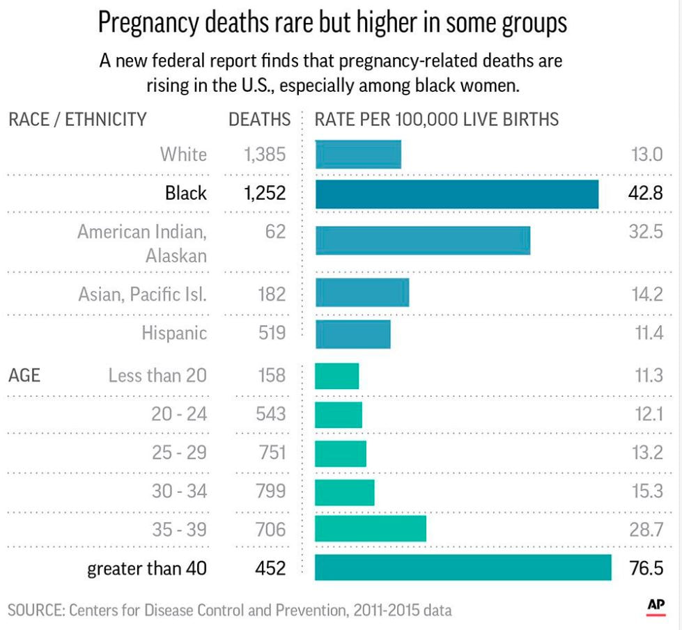 There are a few logistical elements that are hard to ignore with the above graph. Firstly, the color gradients seem to serve no purpose – if there was a color scale that served as a key to indicate the differences in the number of pregnancy-related deaths (i.e. lighter blue hues for less deaths, darker blues for more), that would make more sense. Secondly, I feel that the bars shouldn’t be so staggered as they are. Perhaps it’s just a matter of opinion, but I think that they should be ordered by either greatest to least or least to greatest deaths per 100,000 live births. The way it is presented now, my eyes dance all over the page. Thirdly, the values represented by each bar are terribly inconsistent – why are 32.5 and 76.5 so similar in size, along with 42.8? Here is a more effective graph (found on the CDC website): 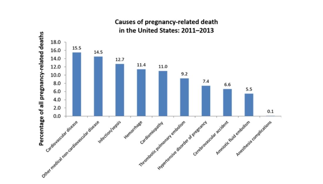 This graph doesn’t present the exact same information as the first, but it does avoid the unnecessary color scale, and the causes of pregnancy-related deaths or ordered from highest percentages to the lowest. Is it the most visually compelling graph? Perhaps not. But it avoids clutter and unnecessary bells and whistles, and the use of color is simplified. 3. With this chart, we run into the issue of problematic bar graphs again: 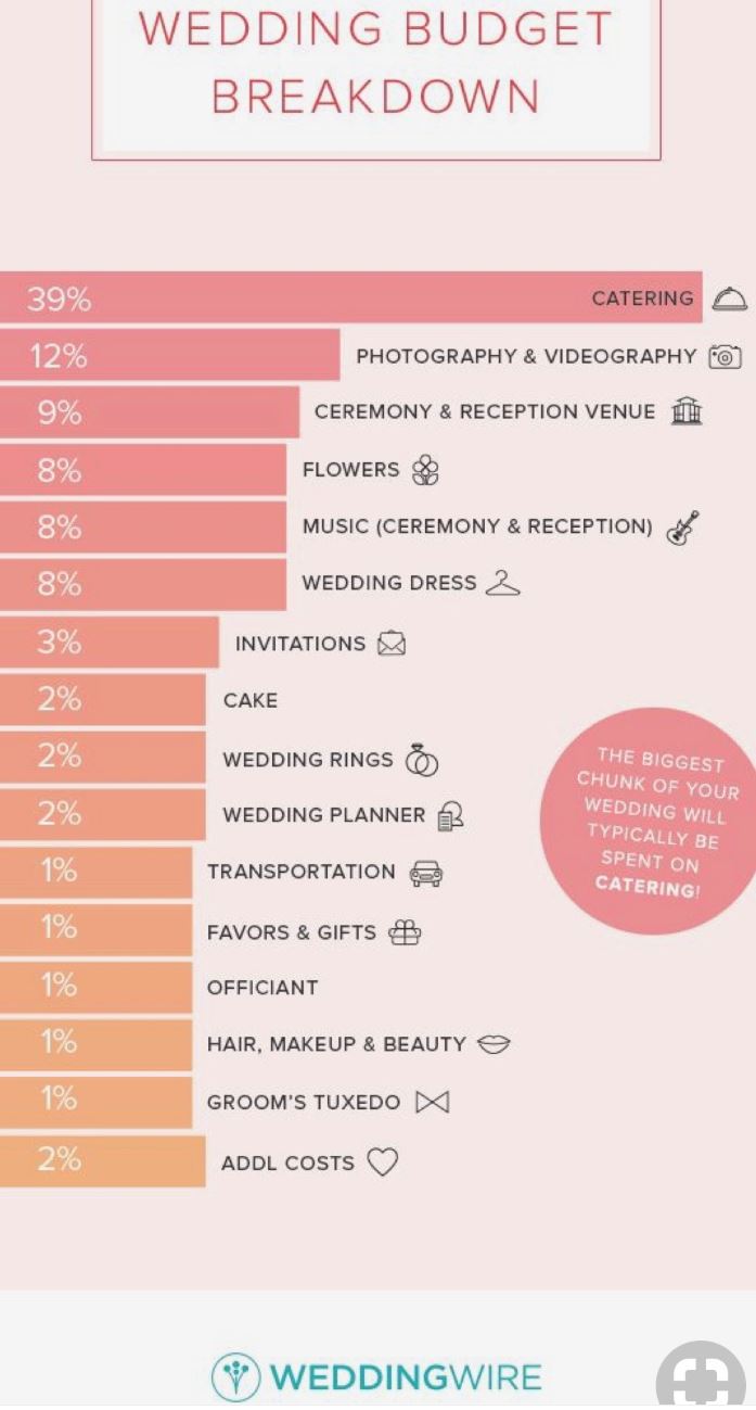 Similar with the previous graph, I’m not entirely sure why there’s a color scale. Maybe it’s there for the sake of aesthetics, but it doesn’t seem to serve a real purpose. Again, I feel that the graph would look better if the cost percentages were ordered from largest to smallest. Also, I’m not really sure why the 3% isn’t less than half the size of the 8% bar…there’s inconsistency throughout this chart when it comes the numerical values. One of the best pieces of advice Tableau offers aspiring chart creators has to do with the power of simplicity: “Unnecessary color does not add value. You should be able to justify every single color on your dashboard: why did you choose any specific color, and what does it communicate to your user?” This would’ve been a question best asked before the above color gradient was created. The following graph isn’t perfect (and it’s also from Wedding Wire) and it does use an unnecessary color scale, but I like how it broke down the variation as far as what *most* couples spend on a specific wedding item (cake) versus those with higher or lower budgets. The numbers make more sense than in the previous graph, and they provide greater context. 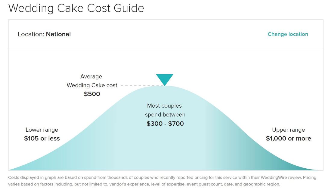  Perhaps one of the most overwhelming aspects about data and creating data visualizations is the amount of options one has when choosing how to represent statistics and numeric information in a compelling way. There isn’t necessarily *one* right type of graph or chart but nevertheless, one choice may be substantially more effective than another. In Chapter 2 of their book “Making Data Visual,” authors Danyel Fisher and Miriah Meyer address the challenge of “refin[ing] high-level questions into specific, data-driven tasks,” with the end goal being to create a “set of concise design requirements for a visualization tool that supports finding answers to those questions” (Fisher and Meyer, p. 9). By breaking down some public data in Excel, I have gained better insight as to what information is truly most important and how to share it. Socio-Economics Around the World Below, I’ve included a screenshot of data provided by the World Health Organization (WHO) (“World Health Statistics Socio-economic and Demographic”) indicating various socio-economic changes in regions around the world (such as population growth rate, fertility rate, literacy rate, school enrollment, gross national income per capita, and data regarding the number of a region’s residents that live under the poverty line) between 1995 and 2005: 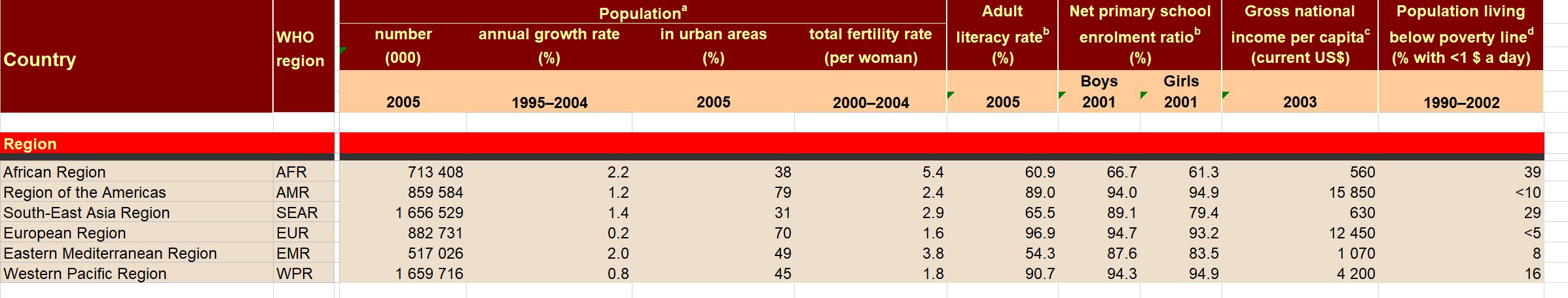 However, I only want to focus on a few of the numbers - specifically the number of people in each region in 2005, the growth percentage in population between 1995 and 2004, and the population growth in urban areas. That being said, here is a clean screenshot showing that information: 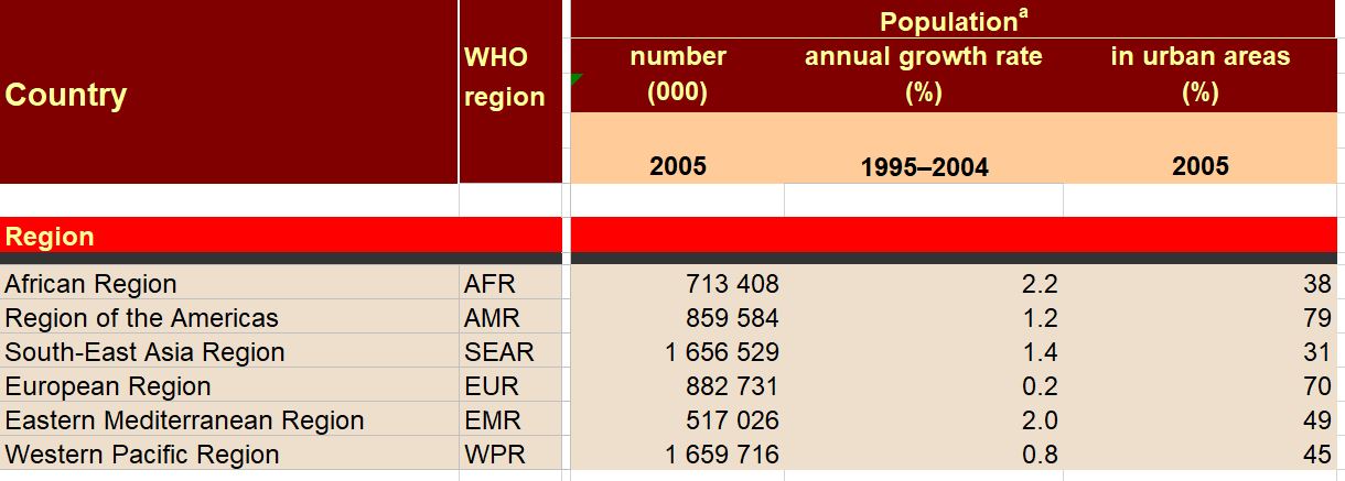 I believe the best way to present this data would be in the form of a global map. The regions on the map could be highlighted with different colors and filled with different shapes (i.e. polka dots or diagonal lines) to indicate an increase/decrease in population growth and the current population of residents in each place. Mortality by Disease Using information provided by the Centers for Disease Control and Prevention (CDC), I used Excel to input the number of deaths in 2016, percentage of total deaths, percentage change from 2015 to 2016, and the ratio of deaths by sex (this information can be found in full on page 6 of the report). 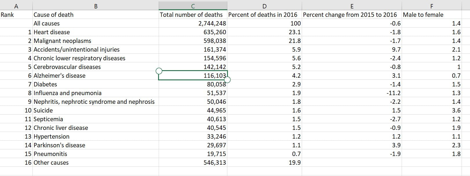 With this information, I’d want to explore which medical conditions affect more males versus females, get a concrete visual on what causes of death health-conscious people should be most wary of, and what causes of death seem to be seeing no improvement from year to year. For example, accidental injuries, Alzheimer’s disease, and Parkinson’s disease appear to be on the incline. I believe one of the best ways to present this data would be in the form of a line chart. Although this data only covers 2015 and 2016, it’d be interesting to see the rate at which certain diseases/causes of death impact the population over the course of a few years. There could be different colored lines for each cause of death so that the viewer could clearly see what health conditions (i.e. Alzheimer’s, suicide, etc.) seem most detrimental to society at a given time. We’d probably come to find that certain causes of death will ebb and flow over time while others continue to run rampant. Young Love For my third example, I tracked the number of child marriages (minors age 15 to 17) per 1,000 people in each U.S. state in 2014. This information was collected by researchers from the Pew Research Center who used supplementary data from the U.S. Census Bureau to come up with these numbers. As of 2014, it appears that nearly 58,000 minors between ages 15 and 17 were married, or about five teens per 1,000 people across the board. Here is a quick snapshot of the geographical data from the Pew Research Center:  And here is the information I input into Excel: 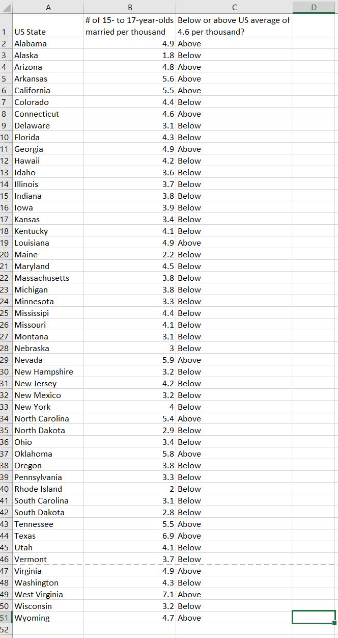 Pew Research already laid out the data in the way that I thought would be most effective - presenting the information geographically; state by state. However, another way the information could’ve been presented is through a vertical bar chart showing how each state’s number of child marriages varies, or two horizontal bar charts indicating a) the number or percentage of child marriages in each state and b) the percentage of females versus males that married young.
Using the information I have, I’d want to clearly see the shift in the higher number of young marriages in some regions (i.e. the Southern region/Bible Belt) versus states with less child marriages, and identify if states’ populations factor into this data. I’d also want to explore information that isn’t as obvious, such as whether or not the overall education, cultural perspective, history, etc. of each region may have had an impact on the number of child marriages in each respective state.  For someone who is not necessarily math or numbers-oriented, it came as something of a relief when Scott Berinato, author of “Good Charts: The HBR Guide to Making Smarter, More Persuasive Data Visualizations,” simplified the data visualization process as addressing two key questions: 1) Is the information being presented comprised of conceptual ideas versus data-driven information, and 2) Is the goal of the visual to confirm an idea or explore other ones? (Berinato, p. 54). Knowing the answers to the above two questions will then help data visualizers map out their data points. Berinato identifies four types of information visuals in particular: idea illustration, idea generation, visual discovery (confirmation and exploration), and everyday data visualization. Berinato describes idea illustrations as conceptual, declarative visualizations that “simplify complex ideas by drawing on people’s ability to understand metaphors and simple conventions.” (p. 58). In my opinion, this visual published to Medium is a simple but effective illustration showing how pyramid schemes work. It’s an effective visual because it doesn’t over-complicate the information presented. While the pyramid scheme visual is in fact, shaped like a pyramid, there is a clear, hierarchical structure, as readers are led from the base of the pyramid (where they learn about the recruitment aspect of the scheme) to the top (where they’re shown how the people higher up make their money). There are clear connections between the levels, and readers’ eyes are naturally drawn from the bottom upwards. 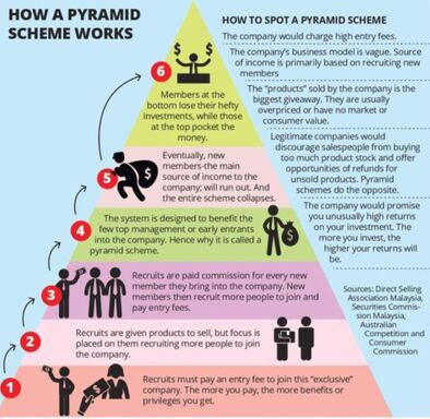 The idea generation visual is conceptual and exploratory. It is somewhat similar to idea illustrations, as they utilize metaphorical elements but are usually developed in brainstorming sessions or other collaborative environments (Berinato, p. 60). Idea generations can manifest in a variety of forms - sketches, brain dumps, and strategy sessions. Although the individual or group involved with the brainstorming may come to choose just one visual in the end, it’s likely that multiple visuals were created in the process. Berinato states that idea generation visualization often happens when the brainstormer is so inspired to come up with ideas, that he or she will write them down on a napkin (p. 60). Keeping this in mind, I used the following “Napkin Finance” example from design thinking company, OpenIDEO. 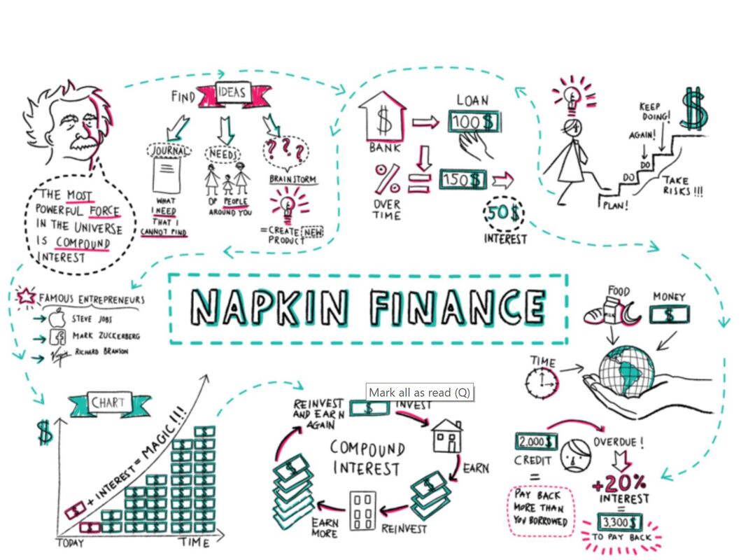 This image was the result of the illustrator coming up with ways to make better, smarter financial decisions. Not all idea generation visuals are as neatly laid out as this one, however, we do see a wealth and diversity of creative ideas for optimizing one’s financial situation, including visuals that illustrate the benefits of compounding, investing, lowering interest rates, and how these strategies will help one’s finances over time. Theses smaller sketches can pave the way for a more clean-cut, final visual. The visual discovery method is data-driven and can either confirm or explore in-depth a set of data. With visual discovery confirmations, Berinato writes that the visualizer aims to identify if the information being presented is rooted in truth, and how else the information can be viewed (i.e. finding out if the number of customer service calls went down because there were less issues with a product, or if customer service representatives were hard to reach). Visual discovery exploration, on the other hand, aims to use data to find ways to solve an issue. One interesting example I can think of that I believe focuses on visual discovery exploration is the following graph that was recently awarded by the Information is Beautiful Awards. “An Alternative Data-Driven Country Map” uses AI and machine learning tools to build connections between countries by clustering them based on a variety of factors including happiness score, healthcare, education, etc. Where there are gaps may indicate the areas in which countries do not share the same factors that equate to overall levels of happiness. (Click the link for a better view of the map) 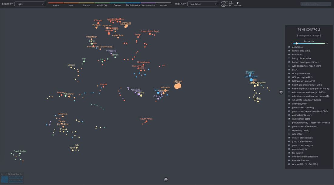 Lastly, the everyday dataviz visual embraces data-driven, declarative information. Berinato believes that these types of visuals emphasize simplicity, clarity, and generate discussion among the groups of people reading the chart presented (Berinato, p. 67). In short, the chart uses existing data to explain to readers information as we know it (i.e. a company’s revenue growth in a given year, amount of time spent on social media over time, percentage of data used over a month, etc.). This chart from Statista, for example, shows the most popular Instagram profiles by indicating the number of Instagram followers in millions as of May 2019. 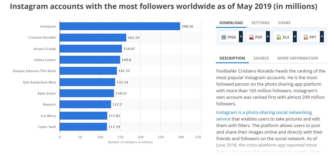  It’s hard for me to imagine a world in which data visualization existed long before the advent of the PC. The fact that Florence Nightingale was able to track the mortality rate during the Crimean War (comparing deaths by combat versus disease) and the fact that Charles Minard could outline the play-by-play of Napoleon’s defeat in Russia long before the birth of the computer is nothing short of phenomenal.
I believe that the main difference in data visualization before and after the invention of the PC has to with the increasing accessibility to computers. In the first chapter of his book “Good Charts: The HBR Guide to Making Smarter, More Persuasive Data Visualizations,” Scott Berinato describes the “disruptive, democratizing” aspect of widespread dataviz use (p. 26). He writes: “This century has brought broad access to digital visualization tools, mass experimentation, and ubiquitous publishing and sharing” (p. 25). In other words, dataviz tools became more accessible to us non-scientists and non-researchers – with all the design programs and tools provided by computers and Internet, data visualization evolved into an art form, versus a pure science. I would argue that over time, the art that illustrates a data set became almost just as important as the information being presented by it. Data visualizers are, in the words of Berinato, “attempting to understand dataviz as a physiological and psychological phenomenon…borrowing from contemporary research in visual perception, neuroscience, cognitive psychology, and even behavioral economics” (p. 26). Essentially, the words “statistics” and “data visualization” cannot be used interchangeably. Statistics looks at the numbers, while the representation of those numbers speaks to how humans (in all our complexities and thoughts) should perceive this information. The benefits of technological advancements in data visualization over time are their accessibility for nearly anyone with a computer and some degree of visual literacy, the tools available that allow one to manipulate data into different, visually compelling mediums, and the fact that visualizing data can be done with relative ease (versus in the days when computers didn’t exist). But some of the cons that come with these technological advancements are the ease with which one can just as quickly manipulate data to tell false stories, and perhaps for some, being ingrained with the idea that how “pretty” a chart looks is more important than the accuracy of the information being conveyed is. For example, one could spend weeks on end creating a data visual where all the information is set up in a beautiful format, but in actuality, is a non-functional chart. In my opinion, a good chart is one that relays numerical information in a way that can be easily digested. It should also be visually appealing – fewer things turn off an audience more than a bland visual with what otherwise contains compelling data. For example, some of the most interesting and engaging charts have been ones that go far beyond the scope of your typical Microsoft Excel-generated bar and line graphs. During one of my earlier Quinnipiac courses, Visual Design, we were prompted to think about what examples of data visualization were most compelling to us and why. The KANTAR “Information is Beautiful” Awards is a great resource for those looking for examples of data that is presented in both a logical and aesthetically pleasing way. One particular data visual that was recognized by the Information is Beautiful Awards was published to Pro Publica this month. The visual, called “What Happened to All the Jobs Trump Promised?” provides a visual representation of just how much the current POTUS has delivered on his promise of creating 8.9 million jobs during his administration. The creators behind the illustration asked poignant questions, such as how much credit the president deserves for creating an average of 188,000+ jobs each month during his time in office, how many job opportunities were already in motion prior to his presidency, and what was delivered as far as job opportunities versus what was promised. The visual uses small graphics of people, each representing 4,000 jobs, to put matters into perspective (click the previous link to get visual). What makes this a “good” chart? To me, it’s informative, simple (but not unmemorable), clear, and engaging. Had the creators used rudimentary line graphs to showcase information about job opportunities during the Trump administrative, the visual might’ve been functional but ultimately uninteresting. A second example of a “good” chart that I’ll share is National Geographic’s “Simulated Dendrochronology of U.S. Immigration 1790-2016.” In short, this illustration shows the growth in immigration to the U.S. between these years and from which continents migrants came. In tree ring image (click link), one can see that in more recent years, there has been significant growth in immigration from Latin American regions. Albeit a little confusing (requiring more than just one glance for me), this tree ring chart is a compelling illustration of how times have changed in regard to the ebbs and flows of migration. While it’s a bit abstract, however, it is certainly more visually engaging than your standard line graph or pie chart. |
 RSS Feed
