 Storytelling has long been a part of the human experience, shifting and evolving to fit our cultural context over time. Histories (including revisionist histories) have been passed down through scrolls and textbooks, the oral tradition, newspapers, and thanks to the introduction of newfangled technologies, television, the airwaves, and more recently, social media. With the seemingly endless amount of content brought on by the latest political scandals, war coverage, mass shootings, economic turmoil, and human interest features, journalists and reporters often serve as the storytellers we rely upon the most. Those who work within the news industry is tasked with a demanding role, one that requires equal parts accuracy, engagement, and tactful storytelling. The benefit of the free American press is that there is great freedom with what can be published. But this also comes with great responsibility. Journalists and news photographers are often the unsung heroes, the deliverers of tragic events, and the ones ultimately responsible for determining what the public sees during the coverage of a significant event or social issue. This is particularly compelling given the negativity bias cycle of ‘bad news,’ and the news industry’s reliance on it to keep business going. The age-old question, “How come reporters only report on bad news?” is an interesting one, especially in light of a political climate where “fake news” is often used as a catchall term for all news stories. According to David Campbell, author of Medium article “Why it’s time for visual journalism to include a solutions focus,” readers largely tend to focus on negative news, remembering the details of those stories more so than that of ‘good news.’ In fact, Campbell’s article concludes that in 2015, BBC News found that 19 of the 20 top stories were high-impact, negative news stories. Daniel McDermon, a writer for New York Times, believes that when it comes to storytelling, one should focus on what an audience will glean from coverage. He writes, “…the relationship between an audience and a storyteller goes two ways. You have to consider who is listening, and your own motivations, to find the right approach.” Take, for example, the haunting image of “The Falling Man” the New York Times published in the aftermath of 9/11. The photo was certainly an accurate representation of the horrors faced by the nearly 3,000 victims who were killed inside the World Trade Center. 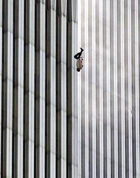 Was the publication doing its due diligence to report the truth? Yes. Did the image accurately convey the tragedy of the day’s terrorist attack? Also yes. But a follow-up question that perhaps has no ‘right’ answer is, was the photo too controversial? While the Falling Man was never officially identified, it is an image that prospective families of the victim will never be able to erase from their minds. Given the tough choices journalists, photographers, and editors must make every day regarding the publication of certain types of subject matter, content, visuals, and rhetoric, it is important to think about what it all comes down to – the intent and impact of a story. Storytellers, whether they are professional journalists, authors, or smartphone-wielding civilians, should be encouraged to think about the following ethics questions: 1. Is the weight of the story more important than the potential impact it can have on viewers? 2. How can one pursue more responsible, solutions-oriented coverage? and 3. How can photo manipulation or over-editing detract from the story as a whole? 1. Prioritizing Ethical Storytelling Over Shock Value Most major news organizations, such as NPR, live by a code of ethics that guides their journalists towards ethical storytelling. NPR’s Ethics Handbook, which can be found on their website, asserts their commitment to respect for those impacted by their work. NPR stipulates, “Everyone affected by our journalism deserves to be treated with decency and compassion...We minimize undue harm and take special care with those who are vulnerable or suffering. With subjects of our coverage, we are mindful of their privacy as we fulfill our journalistic obligations.” Their determination to be informative while abiding by ethical guidelines is noble, but does not always play out in practice. In fact, there have been many instances in photojournalism history when the weight of a story took precedence over the potentially traumatic impact they would have on viewers. Previously, the example of “The Falling Man” was used to highlight the power compelling imagery can have on a story. Going further back into American history, we can look back to one of the most famous examples of iconic journalistic photography – and controversy. Associated Press photographer Nick Ut’s 1972 photograph of the nine-year-old “Napalm girl” taken in 1972 during the Vietnam War. In it, she and other South Vietnamese children are shown fleeing the area of a napalm attack. 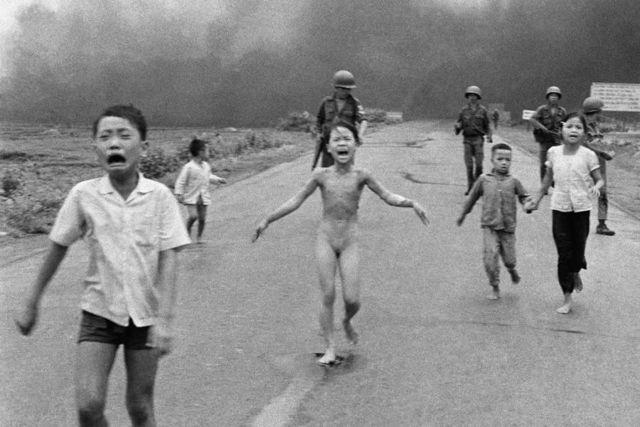 Although some people and groups, including then-president Richard Nixon questioned the authenticity of the photograph, and while the New York Times staff considered not publishing the photo at all, it has since won a Pulitzer Prize and worldwide recognition. So striking was the Napalm Girl image, that the photo has been used as part of other visual works, such as the following artwork by Banksy. 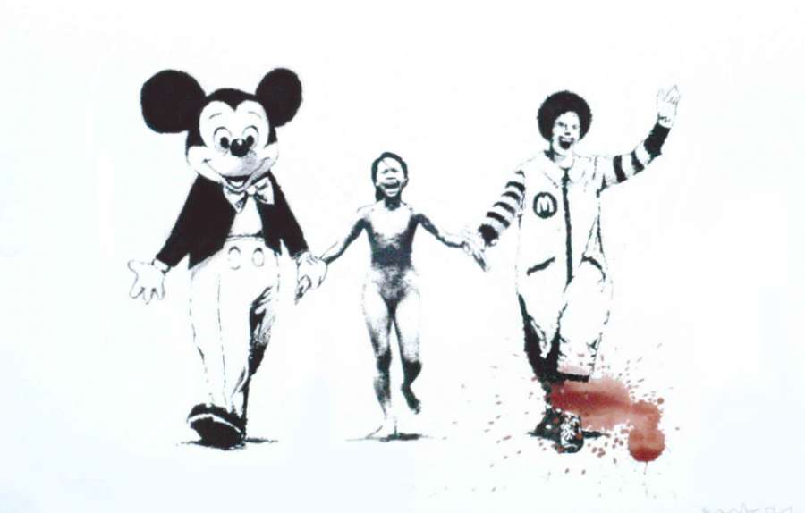 On the one hand, journalists and other storytellers have an obligation to share some of history’s darkest moments, while respecting the lives of those being highlighted. Medium writer Campbell (referenced earlier in this essay) believes that “One of the things that must be done in any discussion about the relationship between images and action is to understand that pictures, by themselves, do not change the world.” Campbell also references The Open Society’s take on documentary/photojournalism photography, which states that images have the potential to bring light to stories that otherwise might not capture worldwide attention and have the power to work hand-in-hand with people and activist groups who are already pursuing solutions to systemic issues such as the ones that may be highlighted in certain stories: “Tackling systemic issues,” Campbell’s articles states, “such as corruption and discrimination, is complex work that involves multiple actors and years of organizing, advocacy, or litigation. We believe that photographers can be more effective when connecting to those who are already working towards change in an ongoing way.” Whether or not the “Napalm Girl” photograph should have been published at all due to its graphic nature, nudity and violence, it can be argued that it did shed deeper insight onto what was going on in the war overseas and the irreversible damage the war had on the Vietnamese population and overall American morale. More recently, a photo published in 2012 in the New York Post depicting a man struggling to climb out of subway tracks as a train heads towards him sparked controversy.  According to the New York Post story, 58-year-old Ki Suk Han had been pushed onto the Times Square subway tracks by a panhandler. Although R. Umar Abbasi, the freelance photographer who had taken the harrowing image of Han in the moments before he was struck by the oncoming train, claimed he had flashed his camera numerous times in an attempt to alert the train conductor to stop, the train could not slow down in time, and Han was killed. “What Abbasi did in those fleeting seconds made him the target of outraged criticism in social media,” Gene Foreman writes in his book, “The Ethical Journalist: Making Responsible Decisions in the Digital Age.” “Abbasi’s critics argued that he should have put the camera down and tried to help [the victim] get back on the platform…The Post’s choice of photograph and caption provoked criticism both on social media and in professional photojournalism circles” (Foreman, 2015, p. 364). While it may be argued that there was not much Abbasi nor the other bystanders could have done to save Han, the Post’s choice of headlining photo is questionable at best. Unlike “The Falling Man” photo the New York Times had published, the victim in this story was identified and will always be remembered in his most vulnerable state – being caught in the wrong place at the wrong time, with mere seconds separating him from death. Ultimately, it is up to the writer or photographer to determine whether an image does indeed enhance the overall mission of a story. The objective, first and foremost, should always be to inform and engage the readers (versus providing the most shock value), as well as compelling audiences to think about ways certain tragedies can be avoided in the future. 2. Storytelling for Solutions  So how can we go about more responsible storytelling? We certainly see examples of irresponsible ‘storytelling’ every day through paparazzi photos, Tweets that were composed without much thought, and even simple gossip. Perhaps it is best to consider how not to go about story-sharing. A prime example comes from the following 2017 story from NPR. A Swedish aid worker was the subject of scrutiny after she posted the following photo of herself embracing a Kenyan girl and a controversial caption to social media, which many accused of perpetuating a ‘white savior’ tone. 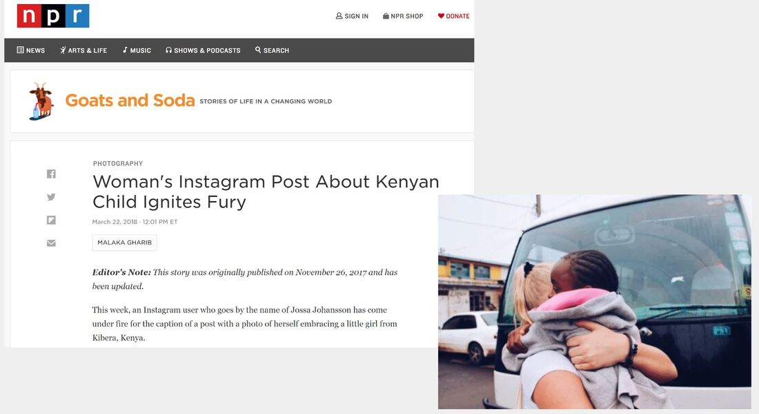 In her post, she compares her own fortunate circumstances to the young girl’s, predicting that the girl would one day “sell her body to earn money” and live alone with her child in a small house made of mud and trees. Youth missions, volunteer trips, or other similar ventures are common, and so is posting about them. But often times, many of the posts will include photos that may show a person receiving medical treatment, or a more self-serving visual of volunteers being embraced the young children they’ve come to help. This can intentionally or unintentionally put the photographer on a pedestal, rather than highlighting some of the issues faced by the demographic they seek to help. Secondly, it is often the case that the photos were taken without consent of the subjects involved, which is especially problematic where minors’ privacy is concerned. In the case of volunteer work and its ties with social media, Christina Haslebacher, Peter Varga, and Hilary Catherine Murphy concluded in their 2019 study “Insights from images posted on social media: Examining the motivations of volunteer tourists” determine that the intention of social media users and their posts of their volunteer work can negatively impact the work itself. They conclude, “If volunteers do, in fact, travel for egoistic purposes and publish pictures online to showcase their humanitarianism, it could be contributing to the risks associated with volunteer tourism. This raises the question of whether the social validation of volunteering and posting pictures online can be aligned with the potential benefits of volunteer tourism, or whether the exact opposite occurs.” In a similar vein, authors Harng Luh Sin and Shirleen He write in their study, “Voluntouring on Facebook and Instagram: Photography and social media in constructing the ‘Third World’ experience” that due to the growing popularity of social media platforms and sharing websites, the line between ethical and unethical photography practices have become blurred. The authors argue, “…the ease of sharing photographs accentuates and stirs up the unequal relations between the photographer and the photographed…here, the very act of using photographs of children in development-oriented NGOs to bring attention to human suffering and possibly work towards alleviating poverty and suffering is in itself paradoxical as it instead reinforces a paternal logic of a superior global North as compared to an inferior global South.” Some simple rules of thumb to follow in situations like the above where ethics, consent, and fear of perpetuating stereotypes come into play are 1. considering the objective of posting or publishing the photo is and asking if it will cause undue harm to the subject(s), 2. receiving permission from the photo subject(s) to publish it, and 3. being wary of any language that could come across as offensive to the people a volunteer is aiding. 3. How Manipulation Can Harm a Story  Sophie J. Nightingale, Kimberley A. Wade, and Derrick G. Watson, authors of the Cognitive Research: Principles and Implications article “Can people identify original and manipulated photos of real-world scenes?” argue that most people do not have the ability to detect whether a “real-world” image has been digitally altered or not. Nightingale, Wade, and Watson write, “In the digital age, the availability of powerful, low-cost editing software means that the creation of visually compelling photographic fakes is growing at an incredible speed … the question of whether people can identify when images have been manipulated and what has been manipulated in the images of real-world scenes remains unanswered.” In fact, some journalists can be blamed for making the line between reality and fiction harder to distinguish. The authors of a 2015 Oxford University study concluded that photographers who did manipulate their photos in some way did so because they viewed their assignments as more artistic, portrait work than raw, authentic photojournalism. They write, “There is an important gap between codes of ethics that prohibit staging and what happens in the field.” Although a few edits to color and lighting may not seem to be a huge sin, darkening the smoke brought on by Israeli war planes in Lebanon - thereby making the damage look worse than it was in reality - resulted in the firing of a freelance Reuters photographer. 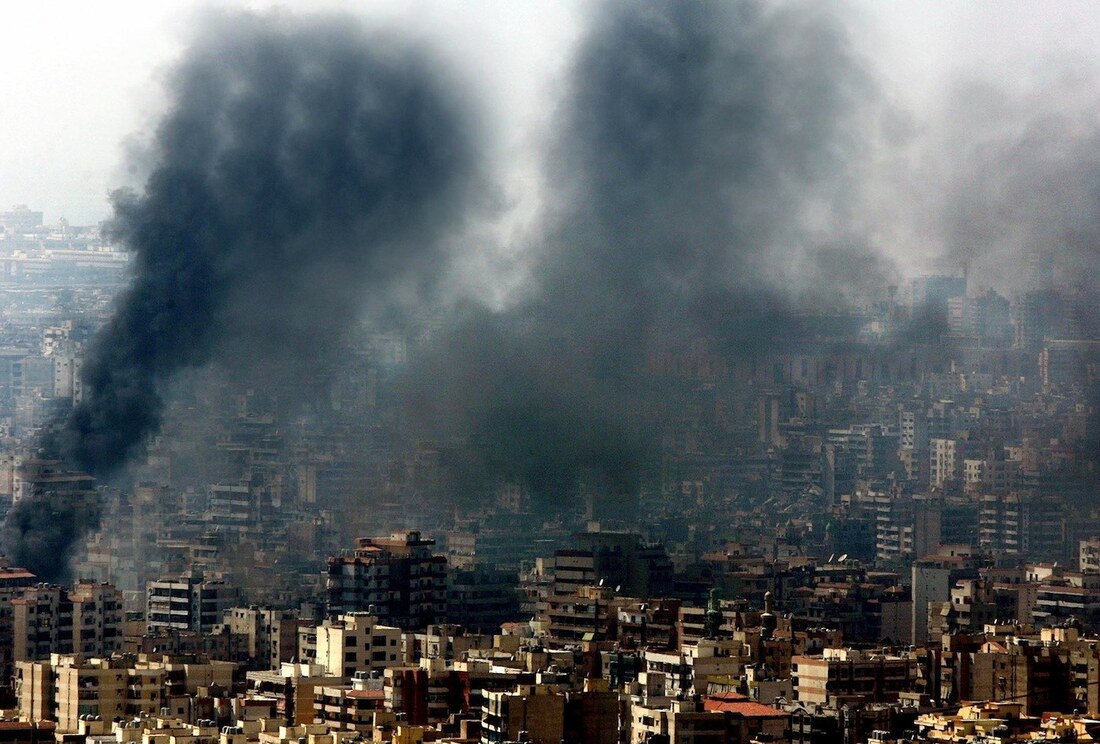 In the following 1989 image, TV Guide similarly was put into hot water for photoshopping Oprah’s head onto the body of actress Anne Margaret’s body, without the consent or permission of Margaret or her dress designer. 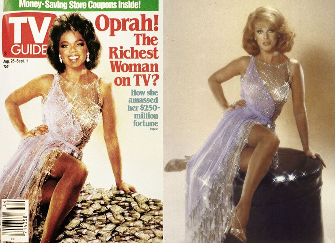 In both these situations, the authenticity of the stories were questioned because of seemingly small tweaks to the original photographs. And as most of us are already aware, the manipulation of photos is a practice prevalent in the health, beauty, and fitness industries. Proficient Photoshop experts will know how to change skin tone, eliminate blemishes and stretch marks, and even change eye color if it increases the sell-ability of certain products. In the following image of pop songstress Britney Spears, we can see that she was already stunning before, but her image was nonetheless still manipulated to make her appear even more desirable. 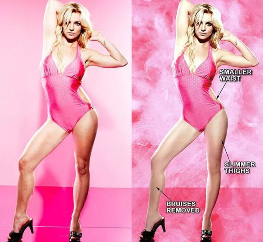 However, with more body-positive messages being created by the marketing minds behind companies like Dove, Aerie, and Playtex, it would seem that the shift towards more authentic storytelling is becoming more of the norm. Parting Thoughts  “Stories,” writes public relations expert Michael L. Kent, in his essay, “The power of storytelling in public relations: Introducing the 20 master plots,” “have the power to inform, persuade, elicit emotional responses, build support for coalitions and initiatives, and build civil society.”
Even if one is not a professional journalist by trade, having the opportunity to wield a pen, camera, or even just an iPhone can be enough to put one in a powerful position as storyteller. It is also a position of great responsibility, one that requires wisdom, discretion, and a true ability to understand and empathize with those whose stories we seek to share, as well as those we choose to share them with. It is not always easy to discern whether a story should be shared or not, and in what way. But by looking inward and determining the intention behind our actions, doing no harm, and letting the story speak for itself without additional embellishment, we’ll have added powerful contributions to the story of the human experience. Works Cited Banksy Editions Guide. Banksy. Can't Beat The Feeling. Screen Print, 56 X 76 Cm. 2004.. 2004. Web. 4 Mar. 2018. Campbell, D. (2018, January 22). Why it’s time for visual journalism to include a solutions focus. Retrieved October 13, 2019, from https://witness.worldpressphoto.org/why-it-is-time-for-visual-journalism-to-include-a-solutions-focus-5be15aec3afc. (MODULE 5) Conley, K., & Abassi, U. R. (2012, December 4). Suspect confesses in pushing death of Queens dad in Times Square subway station. New York Post. Retrieved from https://nypost.com/2012/12/04/suspect-confesses-in-pushing-death-of-queens-dad-in-times-square-subway-station/ Foreman, G. (2015, June 2). The Ethical Journalist: Making Responsible Decisions in the Digital Age. Language Arts & Disciplines. Gharib, M. (2018, March 22). Woman's Instagram Post About Kenyan Child Ignites Fury. NPR. Retrieved from https://www.npr.org/sections/goatsandsoda/2018/03/22/596002482/womans-instagram-post-about-kenyan-child-ignites-fury Hajj, A. (n.d.). Smoke billows from burning buildings destroyed during an overnight Israeli air raid on Beirut’s suburbs. August 5, 2006. Many buildings were flattened during the attack. photograph. Haslebacher, C., Varga, P., & Murphy, H.C. (2019, February 20). Insights from images posted on social media: Examining the motivations of volunteer tourists. Journal of Human Resources in Hospitality & Tourism. Retrieved October 13, 2019, from https://www-tandfonline-com.libraryproxy.quinnipiac.edu/doi/full/10.1080/15332845.2019.1558490 Kent, M.L. (2015, November). The power of storytelling in public relations: Introducing the 20 master plots. Public Relations Review. Retrieved October 13, 2019, from https://www-sciencedirect-com.libraryproxy.quinnipiac.edu/science/article/pii/S0363811115000570 Kleinfield, N. R., & Drew, R. (2001, September 12). A Creeping Horror: Buildings Burn and Fall as Onlookers Search for Elusive Safety. New York Times, pp. A1–A7. McDermon, D. How to Tell a Story. Retrieved October 12, 2019, from https://www.nytimes.com/guides/smarterliving/how-to-tell-a-good-story NPR Ethics Handbook. (n.d.). Retrieved September 29, 2019, from https://www.npr.org/ethics. (MODULE 4) Nightingale, S. J., Wade, K. A., & Watson, D. G. (2017, July 18). Can people identify original and manipulated photos of real-world scenes? Cognitive Research Journal. Retrieved October 8, 2019, from http://cognitiveresearchjournal.springeropen.com/articles/10.1186/s41235-017-0067-2. (MODULE 7) Oprah! The Richest Woman on TV? (1989, August). TV Guide, 1–2. Staging, Manipulation and Truth in Photography. (2015, October 16). New York Times. Retrieved from https://lens.blogs.nytimes.com/2015/10/16/staging-manipulation-ethics-photos/# (MODULE 4) Sin, H.L., He, S. (2018, November 28). Voluntouring on Facebook and Instagram: Photography and social media in constructing the ‘Third World’ experience. Tourist Studies. Retrieved October 13, 2019, from https://journals-sagepub-com.libraryproxy.quinnipiac.edu/doi/10.1177/1468797618815043 Ut, N. (n.d.). Napalm Girl. Photograph. Woodward, E. (2014, May 21). The Most WTF Celebrity Photoshop Fails Of All Time. Retrieved September 29, 2019, from https://www.buzzfeed.com/elliewoodward/the-most-wtf-celebrity-photoshop-fails-of-all-time. *All other photos were from Unsplash (an alternative to iStock)*
0 Comments
 With the sheer amount of content, editing tools, and programs readily available to visual storytellers, there’s no shortage of gaffes that can be made during the pre-publishing process. Some of the ones that most immediately come to mind include failing to properly attribute a photographer or artist for their work one might’ve used for their own project, using incredibly cheesy, overused, or stereotypical iStock photos for brand marketing, doing a choppy Photoshop job on models’ images for a beauty magazine, and staging a photo to make a story seem ‘cooler’ than it was in actuality. As unoriginal as using Stock images for advertising can be, and as questionable as over-editing magazine images is, I’d consider the blurring of lines between truth and fiction in nonfiction storytelling - namely journalism - the greatest visual storytelling sin. Why is this? I wouldn’t say that using Stock photos is a sin, so much as uncreative. Photoshop, or rather the overuse of it (particularly in the health and beauty industries), has certainly given cause for many impressionable viewers to question their own appearance and self-worth (often equating the two), but seems to be an expectation in advertising. However in an industry like journalism where honesty, fairness, and balance are the key pillars (though the current political climate may suggest otherwise), doctoring or staging a photo in such a way that makes it anything less than genuine goes against these standards. The New York Times reported in 2015 that during that year’s World Press photo competition, a significant amount of entries were disqualified from the contest due to “manipulation or excessive digital post-processing.” In conjunction with Oxford University’s Reuters Institute for the Study of Journalism, World Press also surveyed photographers who entered the photo competition and found that over 50 percent of news photographers who had participated in the survey admitted that they occasionally stage photos - even though it goes against the rules stipulated by most major news services. The researchers also hypothesized that “some news photographers might have responded thinking of portrait assignments, rather than news stories.” I reference the following photo faux pas in my Module 5 Ignite presentation, originally taken (and edited) by Reuters freelance photographer Adnan Hajj, who committed the sin of excessive photo alteration. In short, his 2006 photos depicting dark, billowing smoke clouds in Beruit, Lebanon resulted in what was known as “Reutersgate” - Hajj was fired from his position for making significant edits to his images of the Lebanon War. By darkening parts of the image and adding extra smoke clouds and missile flares, he added more drama to the war zone - which really needed no extra damage depicted - and let readers believe that what was presented was reality. Sophie J. Nightingale, Kimberley A. Wade, and Derrick G. Watson, authors of the Cognitive Research: Principles and Implications article “Can people identify original and manipulated photos of real-world scenes?” argue that most people do not have the ability to detect whether a “real-world” image has been digitally altered or not. This is a compelling conclusion because in a world where “Fake News” isn’t just a Trump-ism but also a critical issue in a fast-paced digitally-savvy society, it seems that it will be harder still to know what is real and what isn’t. Nightingale, Wade, and Watson write, “In the digital age, the availability of powerful, low-cost editing software means that the creation of visually compelling photographic fakes is growing at an incredible speed … the question of whether people can identify when images have been manipulated and what has been manipulated in the images of real-world scenes remains unanswered.”
Given that journalists and news photographers rely on the newsworthiness of their stories’ content and imagery for readership, readership that ultimately keeps the papers in business, we know that obtaining images with the most shock or wow value is the end goal. Or, as MediaShift writer Nicole Dahmen writes in her article “How to Do Better Visual Journalism for Solutions Stories,” photos that leave a lasting impression is what they want - after all, the stories with the most compelling images are often the ones that make the front page. But there shouldn’t be a fine line between truth and alteration. Digital editing is a tool to be used sparingly, and not to enhance an already-compelling story. Works Cited Dahmen, N. (2017). How to Do Better Visual Journalism for Solutions Stories. Retrieved September 22, 2019, from http://mediashift.org/2017/11/visually-reporting-solutions-stories-newsrooms-classrooms/. Hajj, A. (n.d.). Smoke billows from burning buildings destroyed during an overnight Israeli air raid on Beirut’s suburbs. August 5, 2006. Many buildings were flattened during the attack. Photograph. Mallonee, L. (2015, July 29). Infamously Altered Photos, Before and After Their Edits. Retrieved October 8, 2019, from https://www.wired.com/2015/07/bronx-documentary-center-infamously-altered-photos-edits. Nightingale, S. J., Wade, K. A., & Watson, D. G. (2017, July 18). Cognitive Research Journal. Retrieved October 8, 2019, from http://cognitiveresearchjournal.springeropen.com/articles/10.1186/s41235-017-0067-2. Staging, Manipulation and Truth in Photography. (2015, October 16). New York Times. Retrieved from https://lens.blogs.nytimes.com/2015/10/16/staging-manipulation-ethics-photos/. Being from the Golden State, seeing more and more people sporting canvas tote bags, bringing their own collapsible, stainless steel straws to restaurants, and swapping out Tupperware with mason jars have become more of the norm over the last few years. And perhaps it is because I live close to the ocean, or perhaps it’s because I live in a college town where many eco-activist groups reside, thatI feel the issue of plastic pollution hits closer to home. Journalists, nonprofit executives, and activists are among the many groups of people that know the power that a compelling visual can have, especially when it comes to social justice, politics, or in this case, reversing some of the devastation we’ve brought to our own environment. But often times, it’s not enough to simply tell an audience that recycling isn’t enough to protect marine life or that one beach cleanup day will solve the problem. That’s why storytellers will use striking visual aids to raise awareness of their chosen issue. “Scientific Storytelling using Visualization” authors Kwan-Liu Ma, Isaac Liao, Jennifer Frazier, Helwig Hauser, and Helen-Nicole Kostis iterate the importance of using “causally-related events” to send a message in a visual story: “First, they take time to unfold, and their pacing matches the audience’s ability to follow them. Second, they hold the audience’s attention by having interesting settings, plots, and characters. Finally, they leave a lasting impression, either by piquing the audience’s curiosity and making them want to learn more, or by conveying a deeper meaning than your normal everyday.” In other words, the visuals need to connect to the viewer’s own life in some way in an engaging way. It’s not always enough for someone to hear that sea turtles can choke on plastic waste; they have to see it for themselves, or visually understand how the actions we take today can affect our tomorrow. 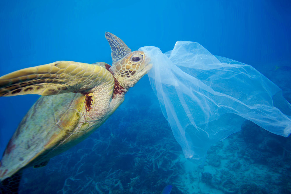 The World Wildlife Fund reports that 8 million tons of plastic are dumped in the oceans annually, and that one in every two marine turtles have consumed plastic at some point in their lives. I chose to present this image first, because audiences are often swayed by rhetoric that involves animals. It also presents the big picture - just how far our plastic use can threaten inhabitants in our environment. Researchers Fabiola Cristina Rodriguez Estrada and Lloyd Spencer Davis iterate in their study, “Design Theories and Practices Into Science Communication” that the fast-paced nature of our society forces communicators to present information in such a way that it can speak above the noise of “multinational corporations, cyberspace, and consumerism.” They write: “For this reason, science communicators need to find ways to connect at the same fast pace and to spread our messages over wide areas that go beyond the limitations of traditional media...We live in an environment shaped by images, which surround us all the time, telling us how to think, feel, and talk.” Which is why it was more compelling for Business Insider reporter Aria Bendix to include a photograph of a to indicate what some groups are doing to make the ocean free of plastic in her article, “The massive plastic-cleaning device invented by a 25-year-old is finally catching trash in the Great Pacific Garbage Patch,” than to simply publish an infographic showing the fast facts of ocean cleanup efforts. 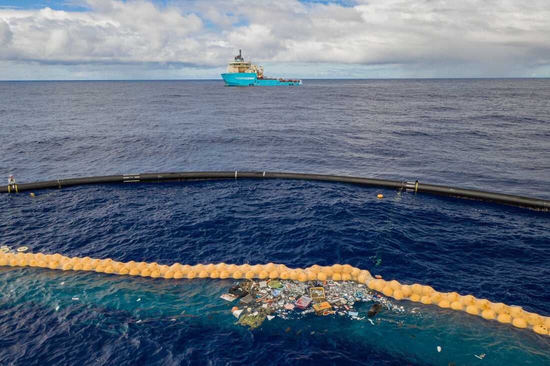 About six years ago, Boyan Slat began creating a U-shaped system designed to remove trash from the ocean by using the sea’s current. Slat founded The Ocean Cleanup, a group that is currently making efforts to remove plastic debris from the Great Pacific Garbage Patch, “a trash-filled vortex in the Pacific Ocean that's more than twice the size of Texas,” according to the article. Seeing the efforts that are being made to fix the plastic problem is not only inspiring, but it answers the question as to what innovations are being pursued and addresses problem-solving - not just the emotional impact of aquatic animals eating humans’ trash. For those who think like scientists, providing causes and solutions to a problem is an effective way of engaging with this type of audience. 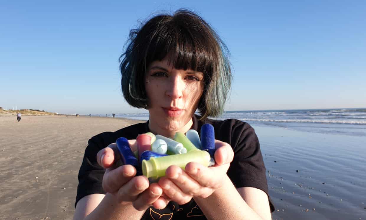 In a similar vein, The Guardian reporter Anna Turns’ article about women activists lobbying their government to remove plastic from women’s sanitary products seeks to share the innovative ways different people from different walks of life are choosing to combat overuse of plastic. Nicole Dahmen, author of MediaShift’s “How to Do Better Visual Journalism for Solutions Stories” recognizes that the doom and gloom of most news stories need to be reported, but reporters also have the responsibility of shedding light on what can be done to solve societal issues. Dahmen writes, “There is growing momentum around the practice of solutions journalism, a fact-based, rigorous reporting method aimed at covering workable responses to societal problems...Indeed, words can provide key details needed for effective solutions reporting, but so can visuals—photographs, video, visualizations, virtual reality and the like.” Medium writer David Campbell would agree with this. In his article “Why it’s time for visual journalism to include a solutions focus,” he notes that most people tend to be attracted to ‘bad’ news,’ causing readers to dwell on and remember more details about the bad than the good. The above image is striking because it involves a visual that references something many people (especially men) consider taboo - periods. The woman in the photo almost seems to challenge readers to come face to face with the problem at hand. But it’s also striking in that the very thing that some might find offensive might also be a key to helping combat plastic overuse. 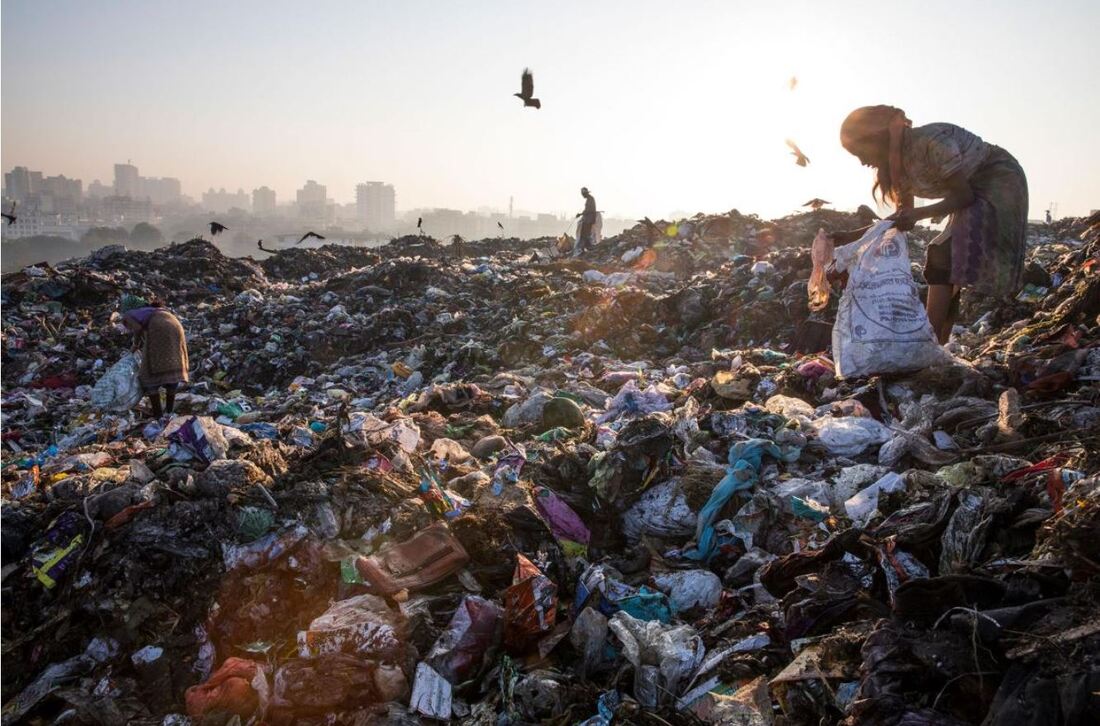 Likewise, National Geographic’s Randy Olson took a similar approach when highlighting the detrimental effects of plastic use in the story, “Plastic bans spread in India. Winners and losers aren’t who you’d expect.” Suddenly, the small handful of plastic tampons seems modest compared to the mountains of garbage shown in the photograph. What I find so interesting about this image is that it shows the environmental impacts of improper recycling and plastic waste to our neighbors abroad. It’s easy to sympathize with the otters and sea turtles that consume our plastic, but I’d venture to say that we aren’t as quick to think about how plastic overuse can be just as strong of an impact to other societies. In his 2013 TED Talk, National Geographic photographer David Griffin shared on the importance and impact that photo stories can reveal, beyond the surface level: “[Photos] that go beyond the superficial or just the immediate that demonstrate the power of photojournalism. I believe that photography can make a real connection to people and can be employed as a positive agent for understanding the challenges and opportunities facing our world today.” 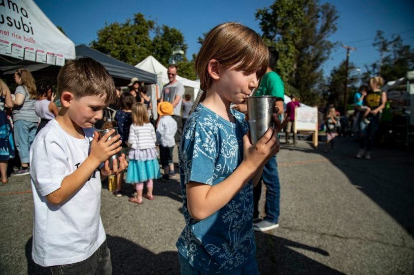 Perhaps this is why I find the above photo, taken from a Los Angeles Times article about a family vowing to go plastic-free, a simple but powerful example of a story that combines good storytelling with a real-world issue. In this image, two children are shown at a farmer’s market sipping out of stainless steel cups (no straw!) rather than styrofoam containers with plastic lids. Researcher Hugh J. Watson observes in his report, “Data Visualization, Data Interpreters, and Storytelling,” that “The focus of storytelling is to capture listeners’ attention with a narrative that is supported by visualizations...Your listeners will ask themselves what the story means to them. Put yourself in their place when creating the story. Include specific, personalized examples that people will remember” (Watson, 2017, pp. 9). That being said, I’d like to think that the children challenge readers to evaluate their own actions and think about the small ways they too can make a difference in the world around them. What I think is most compelling about all of these different images from various news sources is that they are all connected to the same issue (plastic’s negative impact on the environment) even though individually, they touch upon different parts of the plastic story. As news organizations shift more towards solutions-oriented storytelling and incorporating more visually compelling elements into technical subjects like science, medicine, and education, I look forward to being inspired. Works Cited Bendix, A. (2019, October 2). The massive plastic-cleaning device invented by a 25-year-old is finally catching trash in the Great Pacific Garbage Patch. Retrieved October 3, 2019, from https://www.businessinsider.com/ocean-cleanup-catches-plastic-great-pacific-garbage-patch-2019-10. Campbell, D. (2018, January 22). Why it’s time for visual journalism to include a solutions focus. Retrieved October 3, 2019, from https://witness.worldpressphoto.org/why-it-is-time-for-visual-journalism-to-include-a-solutions-focus-5be15aec3afc. (MODULE 5) Dahmen, N. (2017). How to Do Better Visual Journalism for Solutions Stories. Retrieved October 3, 2019, 2019, from http://mediashift.org/2017/11/visually-reporting-solutions-stories-newsrooms-classrooms/ (MODULE 4) Estrada, F. C. R., & Davis, L. S. (2015). Improving Visual Communication of Science Through the Incorporation of Graphic Design Theories and Practices Into Science Communication. Science Communication, 37(1), I40–I48. doi: 10.1177/1075547014562914 (MODULE 6) Fight Against Plastic Pollution. (n.d.). Retrieved October 3, 2019, from https://www.theguardian.com/world/2019/oct/02/the-women-taking-the-plastic-out-of-periods. How Photography Connects Us - David Griggin. (2013). Retrieved from https://ed.ted.com/lessons/how-photography-connects-us-david-griffin (MODULE 6) Ma, K.-L., Liao, I., Frazier, J., Hauser, H., & Kostis, H.-N. (n.d.). Retrieved October 3, 2019, from http://vis.cs.ucdavis.edu/papers/Scientific_Storytelling_CGA.pdf. (MODULE 6) Sampathkumar, Y. (2019, February 8). Plastic bans spread in India. Winners and losers aren't who you'd expect. Retrieved October 3, 2019, from https://www.nationalgeographic.com/environment/2019/02/india-single-use-plastic-bans-maharashtra-tamil-nadu/. Spillman, S. (2019, July 19). Living without plastic: One family's journey. Retrieved October 3, 2019, from https://www.latimes.com/lifestyle/story/2019-07-18/living-without-plastic. Turns, A. (2019, October 2). The women taking the plastic out of periods. Retrieved October 3, 2019, from https://www.theguardian.com/world/2019/oct/02/the-women-taking-the-plastic-out-of-periods. Watson, H. J. (2017, February). ResearchGate. Retrieved October 3, 2019, from https://www.researchgate.net/publication/316605154 (MODULE 3)
Journalists have one of the most physically, intellectually, ethically challenging jobs in the world. But those of us who are not journalists but work in multimedia, marketing or simply enjoy sharing stories with our smartphones, we too have the challenge of knowing what makes a situation or event worth sharing, and how to go about it in a way that is respectful and tactful to both subjects and viewers.
Works Cited Banksy Editions Guide. Banksy. Can't Beat The Feeling. Screen Print, 56 X 76 Cm. 2004.. 2004. Web. 4 Mar. 2018. Campbell, D. (2018, January 22). Why it’s time for visual journalism to include a solutions focus. Retrieved September 29, 2019, from https://witness.worldpressphoto.org/why-it-is-time-for-visual-journalism-to-include-a-solutions-focus-5be15aec3afc. Conley, K., & Abassi, U. R. (2012, December 4). Suspect confesses in pushing death of Queens dad in Times Square subway station. New York Post. Retrieved from https://nypost.com/2012/12/04/suspect-confesses-in-pushing-death-of-queens-dad-in-times-square-subway-station/ Gharib, M. (2018, March 22). Woman's Instagram Post About Kenyan Child Ignites Fury. NPR. Retrieved from https://www.npr.org/sections/goatsandsoda/2018/03/22/596002482/womans-instagram-post-about-kenyan-child-ignites-fury Hajj, A. (n.d.). Smoke billows from burning buildings destroyed during an overnight Israeli air raid on Beirut’s suburbs. August 5, 2006. Many buildings were flattened during the attack. photograph. Kleinfield, N. R., & Drew, R. (2001, September 12). A Creeping Horror: Buildings Burn and Fall as Onlookers Search for Elusive Safety. New York Times, pp. A1–A7. Moser, A. (2019, September 27). Who’s really benefiting from celebrity environmental “activism”? Retrieved September 29, 2019, from https://thestrand.ca/whos-really-benefiting-from-celebrity-environmental-activism/. NPR Ethics Handbook. (n.d.). Retrieved September 29, 2019, from https://www.npr.org/ethics. Oprah! The Richest Woman on TV? (1989, August). TV Guide, 1–2. Staging, Manipulation and Truth in Photography. (2015, October 16). New York Times. Retrieved from https://lens.blogs.nytimes.com/2015/10/16/staging-manipulation-ethics-photos/# Ut, N. (n.d.). Napalm Girl. Photograph. Williams, I. (2019, August 30). Billie Eilish reveals she ‘did not consent’ to magazine cover that portrays her as topless cyborg . Metro UK. Retrieved from https://metro.co.uk/2019/08/30/billie-eilish-reveals-she-did-not-consent-to-magazine-cover-that-portrays-her-as-topless-cyborg-10658475/?ito=cbshare Twitter: https://twitter.com/MetroUK | Facebook: https://www.facebook.com/MetroUK/ Woodward, E. (2014, May 21). The Most WTF Celebrity Photoshop Fails Of All Time. Retrieved September 29, 2019, from https://www.buzzfeed.com/elliewoodward/the-most-wtf-celebrity-photoshop-fails-of-all-time. *All other photos were from Unsplash (an alternative to iStock)* Always on My Mind...But Not Always in My Agenda For most of us, relationships serve as a major tenant of our lives. We strive for companionship - platonic or romantic - rearrange schedules to maintain the ones we do have, and work long hours to sustain family members or bank accounts (which ultimately provide the affordability to spend time with loved ones). Much of our socializing often revolves around food, whether it’s a shared family meal, coffee with a professor, or scouring the liquor aisle at the corner bodega on a late night with close friends. Food and love seem to be comprised of a base language almost everyone seems to understand. But in a world as fast-paced as ours, finding the time to fuel both has become a challenging undertaking. In fact, a 2018 Bureau of Labor Statistics report noted that Americans spend just over an hour on average taking the time to eat and drink during each workday, and spending close to an hour and 15 minutes of each weekend day on food consumption. It would appear that our society’s relationship with food has waned under the pressures of work, school, and other obligations. The following photo series aims to showcase a week’s worth of ‘food scenes’ in their most authentic form, at all times of the day. In some instances, the practice of dining is done thoughtfully and intentionally, while at other times, it’s simply a biological necessity.  5:00 p.m. on a Friday: “The Golden Hour” - For many working Americans, going out for a coffee usually means going out to grab it from the nearest Starbucks, only to take it back to the office. In Sweden, the practice of “fika” or “coffee break” is just that - a dedicated break from work and other activity to sit still, enjoy a hot beverage, and simply just be.  2:00 p.m. on a Saturday: On those rare nights out, it’s nice to take an Instagrammable picture of a really good meal. Although it’s easy for people - especially Millennials and Gen X-ers - to spend much of their disposable income on eating out, it can be justifiable. Eating out often means setting aside time for community and socializing. 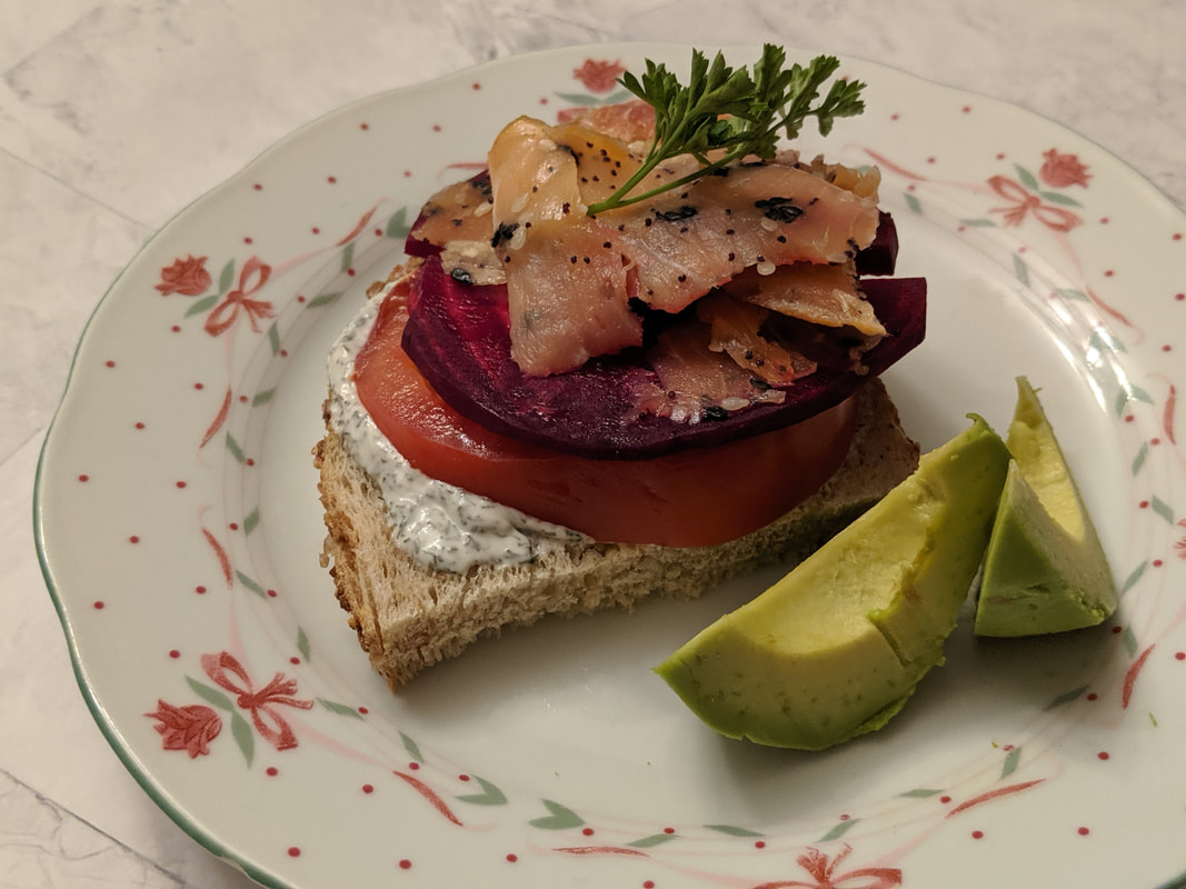 7:30 p.m. on a Sunday: There’s a reason why they call it “culinary arts.” Much like a painting or a piece of music, the art of cooking and presentation requires creativity, diligence, and aesthetic flair - and of course, time. 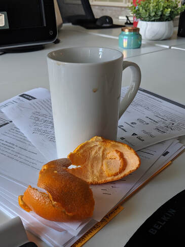 9:00 a.m. on a Monday: Desk or dining table? For those working 9-5 positions, this sort of food setup is a familiar sight. 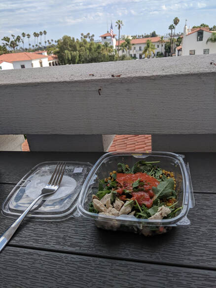 Noon on a Monday: A rare shot of lunch not being eaten at a desk (not pictured: company laptop). It’s been reported that 50 percent of working Americans tend to eat lunch alone, and the 6 out of 10 choose to consumer theirs at their desks. That being said, there’s nothing quite like spending five whole minutes dedicated to lunching with a view of the Santa Barbara beaches.  7:00 p.m. on a Tuesday: Not everyone can be an Iron Chef every day of the week - unless that’s your day job, of course. Is the microwave the most fashionable way to go? No. But it is efficient. 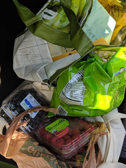 2:30 p.m. on a Wednesday: Modern-day hunting and gathering. Perhaps one of the reasons why much of society doesn’t appreciate food is because it’s incredibly easy to obtain,. Our hunting grounds are Trader Joe’s, Costco, Albertsons, and the like, while our weapon of choice is credit or debit. 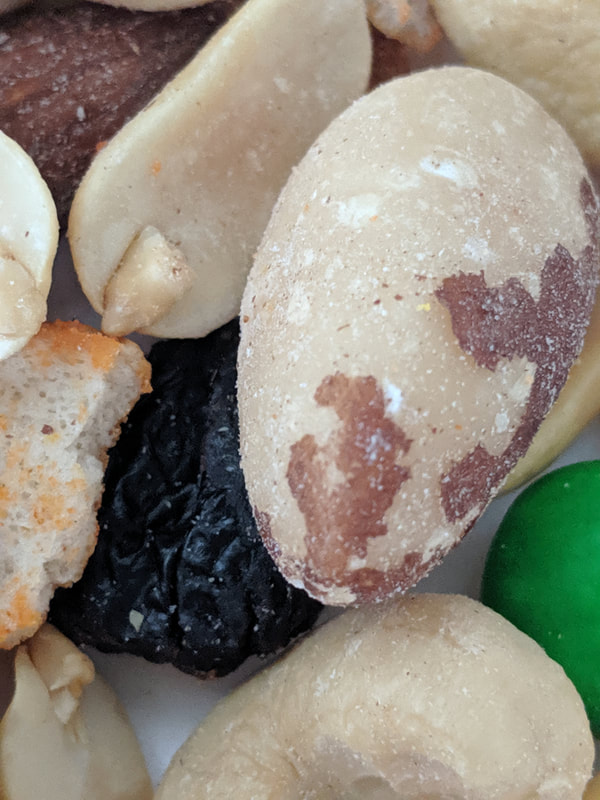 10:00 a.m. on a Thursday: A close-up shot of breakfast. With an early morning commute, team brainstorming sessions, and hundreds of training documents to work through, a small handful of nuts has to be enough sustenance for breakfast on the faster-paced days.  7:00 p.m. on a Thursday: Anything made from scratch is a labor of love. Food brings people together, and is quite arguably a universal language. It’s best prepared, eaten, and enjoyed in good company - the only thing sweeter than the donuts? Bringing a little bit of happiness to someone else’s palate.
It’s not uncommon to hear someone say, “I love food!” or “I’m a total foodie.” And why shouldn’t one be an enthusiastic foodie? There are certainly enough food trucks, microbreweries, fusion cuisine, and strange trends (i.e. charcoal ice cream) to confirm that love. But much like our relationships with our loved ones, using the L-word is easy to say yet harder to demonstrate, given how many things seem to drive our attention away. Eating is a necessity, yes, but at the risk of sounding cliche, it is also a way of life. It’s meant to be enjoyed and ideally, done in community - it certainly shouldn’t be an inconvenience or something ‘squeezed’ into a schedule. _____________________ Perhaps one of the most pivotal turning points for journalism, other than the introduction of the 24/7 news cycle, was the increased focus on multimedia storytelling. Gone are the days where writers are solely responsible for writing; they also have to shoot their own photos, edit videos and soundbytes, and leverage social media to distribute their stories. Mario R. Garcia, author of the Garcia Media article “Digital storytelling, Part One: The fusion of writing/editing/design,” describes this marriage of story writing and multimedia as “WED” (writing, editing, and design). Rather than photos being added on as an afterthought to a story, they are meant to complement and be woven into narratives, becoming “a real marriage, a dynamic fusion of writing and visual journalism,” Garcia writes. MediaShift writer Nicole Dahmen would agree with this point, stating that “The idea (of photojournalism) is to make images that matter to the specific story, rather than seeking visuals afterward that ‘fit’.” My photo story isn’t the type of cutting-edge photojournalism you might find from the archives of a war zone reporter or an Anderson Cooper memoir. My goal wasn’t necessarily to incite action or inspire change as far as how most of us tend to approach our eating habits; my aim was primarily to showcase honesty in my work (by showing a week’s worth of sporadic meals), while being informative about how and why I, and many other people as well, aren’t always intentional or thoughtful about taking the time to dine, or separating our eating from other parts of our schedules, like work time. As such, some of my photos like more ‘posed’ and artsy, and those tend to be the ones where I took the time to either pay someone else to make my coffee or meal for me, or put time in my schedule to cook for myself and others (note the photos of the “Golden Hour” coffee, the open-face sandwich, the meatballs, and the donuts baking in the oven). The other ones seem rather ordinary by comparison, and that is to demonstrate how mealtimes during the busier parts of my week are rushed and perhaps aren’t as thought through (note the grocery bags, the close-up of trail mix, the salad, and the tangerine peel). In short, this photo project was a food journal of sorts, with the intent of bringing to light how difficult it can be to separate an enjoyable, sustenance break in the day from everything else I may have going on in my life. But when I am able to dedicate more time to food preparation and consumption, or investing more time in myself by having someone else do the preparation, I feel more fulfilled, and it shows in the photography. In his essay “Multimedia Storytelling for Digital Communicators in a Multiplatform World,” author Seth Gitner writes about the growing need for consumers to share all the interesting visual imagery in their posts on social media; modern-day society’s own version of everyday visual storytelling. Because photography has become more accessible to the layperson, anyone can be a visual storyteller simply by owning a phone with a camera (Seth Gitner, 3 and 5). This is the sort of perspective I wanted to convey through my work. The pictures are decent, yes, but they also capture the everyday-ness of the environment surrounding the food. In Eman Shurbaji’s Medium article “Photo narratives: Defining picture stories, essays and packages,” he describes photo storytelling as something that is usually done in one perspective: “Unlike essays, a story doesn’t usually include multiple places or characters. Typically, it will focus the edit on one place character that serves as the connective theme in the entire photo presentation.” Furthermore, Shurbaji’s definition of what a photo story is compels me to categorize my own project as such. He writes, “A photo story is about one person, place or situation. It’s the most intimate of the aforementioned photo storytelling methods because it means the photographer is focusing on one character or scene, and letting viewers live through the photos.” In this case however, I would argue that I, the photographer, serve as the main character, even though I am featured in none of the photos. However, it is my eating schedule that is being highlighted. That is the connection between all the photos, even though the camera’s subject changes, as well as the location. Additionally, I believe the Gestalt principles come into play as all of the individual photos help represent the relationship between the average person and their food during the span of one week - it’d be a very different story if each photo on their own comprised the entire story. Carolann Bonner, author of Thoughtbot’s “Using Gestalt Principles for Natural Interactions,” describes the Gestalt theory as a term often associated with psychology that iterates that the sum of something is more significant than each part. In other words, viewers tend to visualize and categorize objects based on whether or not they share similarities, enclosure, continuation, closure, proximity, and figure-ground properties (Bonner, 2019). In the case of my photo story, the photos share similarities in that most of them are close-ups of the same subject (food), and represent continuation, as they are taken chronologically/throughout the course of a week. Some brief definitions of the Gestalt principles: Proximity involves placing objects’ positions closely together to form groups, while Similarity occurs when objects share the same colors, shapes, and other visual properties. Common Fate involves elements within a group changing together, and Figure/Ground Ambiguity refers to white space being used as a background. Lastly, Closure/Continuation occurs when viewers can mentally close the empty spaces and gaps between shapes (Ellen Lupton, 2017, p. 128). Lastly, Action Graphics’ article, “Worth 1,000 Words: The 4 Principles of Visual Storytelling,” challenges consumers of visual stories to think about what four elements of proper visual storytelling are at work. The four elements include authenticity, sensory, relevancy, and archetype. In my work, I strive for authenticity, making my food photos look as candid and ‘real’ as possible while also being good quality (for a camera phone). And because food is involved, the sensory pillar comes into play, as the food will tap into viewers’ senses, while relevancy occurs whenever viewers think to themselves, “I can relate to this” as they progress through the photo story. Bibliography Bonner, C. (2019). Using Gestalt Principles for Natural Interactions. Retrieved September 22, 2019, from https://thoughtbot.com/blog/gestalt-principles (MODULE 2) Dahmen, N. (2017). How to Do Better Visual Journalism for Solutions Stories. Retrieved September 22, 2019, from http://mediashift.org/2017/11/visually-reporting-solutions-stories-newsrooms-classrooms/ (MODULE 4) Garcia, M.R. (2017). Digital storytelling, Part One: The fusion of writing/editing/design. Retrieved September 22, 2019, from https://www.garciamedia.com/blog/digital_storytelling_part_one_the_fusion_of_writing_editing_design/ (MODULE 4) Gitner, Seth (2015). What Ways Do We Think about Visual Storytelling Every Day. Multimedia Storytelling for Digital Communicators in Multiplatform World (1st ed., pp. 3-5). Abingdon-on-Thames: Routledge Publishing. (MODULE 1) Lupton, E. (2017). Design is Storytelling (p. 128). New York, NY: Cooper Hewitt. (MODULE 2) Shurbaji, E. (2014). Photo narratives: Defining picture stories, essays and packages. Retrieved September 22, 2019, from https://medium.com/learning-journalism-tech/photo-narratives-d77b812f99dd (MODULE 4) Time spent in primary activities and percent of the civilian population engaging in each activity, averages per day on weekdays and weekends, 2018 annual averages. Retrieved September 21, 2019, from https://www.bls.gov/news.release/atus.t02.htm Worth 1,000 Words: The 4 Principles of Visual Storytelling. Retrieved September 22, 2019, from https://actiongraphicsnj.com/blog/4-principles-visual-storytelling/ (MODULE 1) 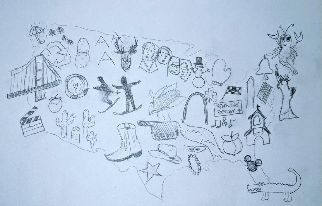 The image I created for Part 1 of this assignment is what I would describe as a hand-drawn collage, the intent being to illustrate the most popular state landmarks, contributions, and perhaps even the stereotypes we Americans as well as non-Americans often think of when certain states and regions come to mind. It was my goal to create and manipulate the elements in such a way that one could make sense of the information presented and use it to mentally navigate what the U.S. regions have to offer so that the map “delivers value” to users (Interaction Design Foundation, 2019).
Admittedly, I am not the best artist, but hopefully my audience will think I have succeeded in highlighting some of the U.S. region’s best-known sites, commodities, and activities. For example, I included several famous historical sites, such as the Golden Gate Bridge in San Francisco, California, Mount Rushmore in South Dakota, the Gateway Arch in Missouri, and the Statue of Liberty in New York. I included produce as well, as exemplified by the potatoes of Idaho, Kansas corn, and the California orange (Maine is also famous for lobster, hence the lobster sketch on the far east side). I also added various activities that are popular in each state that many people tend to think of when those respective states come to mind, i.e. skiing in the Colorado/Utah areas, gambling in Nevada, Mardi Gras in Louisiana, DisneyWorld in Florida, the music capital in Tennessee, and the Indianapolis 500 in Indiana. Finally, I included some ‘stereotypical’ elements for some of the states, like rain in Washington, the recycling symbol for Oregon, cowboy elements for Texas, a crocodile for Florida, and a church in the Bible Belt region. Some benefits of the collage method? Ekaterina Walter and Jessica Gioglio, authors of “The Power of Visual Storytelling: How to Use Visuals, Videos, and Social Media to Market Your Brand” say that in the case of collages, more can be better, because multiple images may be able to say more than one standalone picture (Gioglio and Walter, 2014, pp. 44). They also make the argument that in industries where telling a compelling visual story is critical (such as branding, marketing, videography, and public relations), sticking with one, generic image may not cut it anymore: “In line with consumer photography trends, savvy companies understand that there’s more than one way to add a storytelling element on their social media channels through imagery. From traditional images to user-generated content, collages, images with text overlays, memes, and more, there’s a lot of creative potential for companies to tap into” (pp. 24). In short, rather than simply creating a map of the U.S. and writing out what each state is well-known for, or color-coding the map to show population density in the states, I felt that it was more impactful to provide a snapshot of what many of the states have to offer those who aren’t familiar with the U.S. Similarly in Ellen Lupton’s “Design is Storytelling,” she iterates the importance of creating images that not only capture, but hold onto viewers’ attention. Our eyes, in short, will often move towards elements that stand out the most or for one reason or another catch our eye. Lupton says, “Like a story, perception is active and temporal...Even when not confronting a specific task, our gaze gravitates toward points of interest, from eyes, mouths, and noses to snakes in the grass and letters on a page” (Lupton, 2017, pp. 116). I feel that based on what certain viewers find most interesting in terms of activities (i.e. skiing versus going to the rodeo), environment (i.e. Pacific Northwest rains versus the deserts of the Southwest), or landmarks (i.e. DisneyWorld versus the Liberty Bell), their eyes will be most drawn to those parts of the map. Lastly, in his report “Data Visualization, Data Interpreters, and Storytelling,” Hugh J. Watson shares on the importance of thoroughly knowing one’s audience when creating any sort of information visual, saying “The focus of storytelling is to capture listeners’ attention with a narrative that is supported by visualizations...Your listeners will ask themselves what the story means to them. Put yourself in their place when creating the story. Include specific, personalized examples that people will remember” (Watson, 2017, pp. 9). This was something I mused deeply while creating my U.S. map. Even though I have a fairly firm grasp on the colorful tapestry that makes up the United States, I wanted to give my viewers an understanding of it as well, as imagery can often be a universal language. Bibliography Gioglio, J., & Walter, E. (2014). The Power of Visual Storytelling: How to Use Visuals, Videos, and Social Media to Market Your Brand (1st ed., p. 24 & 44). New York: McGraw Hill. Information Visualization - A Brief Introduction. (2019, August). Retrieved from https://www.interaction-design.org/literature/article/information-visualization-a-brief-introduction Lupton, E. (2017). Design is Storytelling (p. 116). New York, NY: Cooper Hewitt. Watson, H. J. (2017, February). ResearchGate. Retrieved from https://www.researchgate.net/publication/316605154 The beauty of effective data visualization is that the eye can quickly digest the shapes, colors, and general movement of elements on a page and be able to absorb the bottom line of the information being presented. Data visualizations should be simple, uncomplicated, and uncluttered, especially since they are something we use every day. For example, we rely on Google Maps to provide easy-to-follow, up-to-date imagery and information to tell us where to go, just as we might rely on the instructional infographics presented in a pamphlet that comes with our new tech devices so that we can figure out how to set them up. In his report “Data Visualization, Data Interpreters, and Storytelling,” Hugh J. Watson iterates how more and more researches are gravitating towards increasingly creative ways of presenting information, as traditional methods can often lead to boring presentations, or ones filled with an overwhelming amount of data (Watson, 2017, pp. 8). He writes, “Storytelling can be used in many different settings with a variety of audiences...Stories can be used to explain or to help the audience explore a topic. Presentations should do more than identify a problem. They should suggest a resolution or at least lead to a discussion” (Watson, 2017, pp. 9). It’s one thing to be able to present numerical information in the form of a graph, pie chart, scatter plots, maps, and many other popular charts popular websites like HubSpot recommends. But charts aren’t one-size-fits-all. In fact, while the pie chart is one of the most commonly used infographics, it is not always the most effect chart to use because it is only able to measure pie-sized slices of percentages, i.e. 50%, 75% and so forth (HubSpot, 2019). It can also be easy to get lost in the numbers of a data set, especially for those who don’t necessarily consider themselves ‘analytical thinkers.’ Perhaps that is one of the reasons why I find the work of visual storytellers like Sarah Illenberger and Peter Grundy so fascinating - they prove that a compelling, well-executed visual can convey the core of a message without having viewers get lost in the weeds of numerical information. In the case of Illenberger, she relies on everyday household items to help illustrate her research, such as tissues, clothing, vegetables, and a cactus to represent people’s sexual behaviors (Sarah Illenberger, 2010). Although the concept of gathering data, as well as making it visually appealing, may sound daunting, the result shouldn’t be one that also confuses viewers. It should simplify the process. The author of the Interaction Design Foundation article, “Information Visualization - A Brief Introduction” iterates that the goal of data visualization is to communicate in imagery what is difficult to explain in mere words. However, one must be careful not to fall into the trap of bias, or limiting the information shown in an image to ‘prove’ an agenda: “There is a ‘dark side’ to the presentation of information for understanding and it’s the presentation of information to persuade...It is up to the presenter to decide where the ethical boundaries are in persuading people through information visualization.” The following is my version of a creative representation of qualitative data. Using the vegetables I happened to have in my refrigerator, I used carrots, celery, and mushroom slices to symbolize the rough estimates of food insecurity in the United States between 2016 and 2018 (data gathered from the United States Department of Agriculture Economic Research Service). The celery represents the states experiencing with food insecurity below the U.S. average, the mushrooms symbolizes states where food insecurity is near the U.S. average, and the carrots represent states where food insecurity is above the national average. As a reference, the national average of food insecurity is set at about 11 percent of U.S. households per state (chart data accessible here). 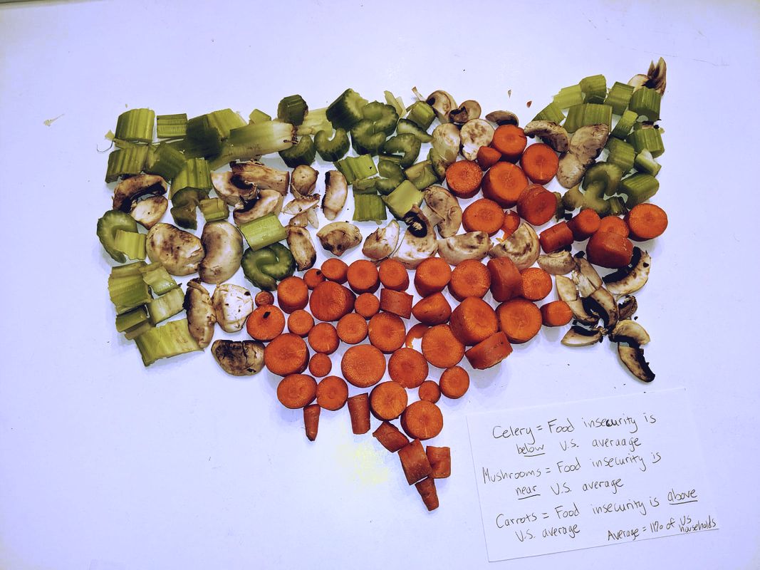 Bibliography
Coleman-Jensen, A., Gregory, C. A., & Rabbitt, M. P. (2019, September 4). Food Security in the U.S. Retrieved from https://www.ers.usda.gov/topics/food-nutrition-assistance/food-security-in-the-us/key-statistics-graphics.aspx#map Data Visualization 101: How to Design Charts and Graphs. (n.d.). Retrieved from https://cdn2.hubspot.net/hub/53/file-863940581-pdf/Data_Visualization_101_How_to_Design_Charts_and_Graphs.pdf Illenberger, S. (2010, October 5). Sarah Illenberger's Infographics. Retrieved from http://allmyeyes.blogspot.com/2010/10/sarah-illenbergers-infographics.html Information Visualization - A Brief Introduction. (2019, August). Retrieved from https://www.interaction-design.org/literature/article/information-visualization-a-brief-introduction Watson, H. J. (2017, February). ResearchGate. Retrieved from https://www.researchgate.net/publication/316605154 Perhaps it is a prominent part of American culture, or perhaps it permeates into most social situations but it seems that part of the human experience is frequently saying one thing while meaning another. For example, saying “Interesting” in response to someone else’s commentary about their day doesn’t usually mean that that person actually found it interesting. In fact, it probably means the opposite. Images can do the same thing; they can seem to say one thing while getting a different or opposite reaction from viewers. This could be done intentionally (which is common for marketing purposes), or it could be because the goal, objectives, and perspective of the designer is different from that of the person seeing the image for the first time. In their article “Designers and Users: Two Perspectives on Emotion and Design,” authors Donald A. Norman and Andrew Ortony make the point that there is often a “mismatch” between the perspective of the designer versus the perspective of the user. They argue: “Differences between designer and user perspectives of the same product are particularly evident with respect to the role of emotions. The designer may intend to induce emotions through the design, but because emotions reside in the user of the product rather than in the product itself, the emotions the user experiences are not necessarily the same as those intended by the designer” (Norman and Ortony). They go on to say that while designers, artists, and creators have the opportunity to instill emotions in those who view their work, thereby having a possible impact on how viewers react, this influence only goes so far. It will ultimately be up to the viewer how he or she will be moved by an image. In Ellen Lupton’s “Design is Storytelling,” she references usability expert Donald Norman’s division of the user experience into three phases: visceral, behavioral, and reflective. Through the visceral process, we quickly process what we see - color, texture, form, etc. We can process this information through our behavior as well - does the image compel us to buy a product or service, read more information about it, and so on? Lastly reflection occurs as we remember what emotions with connect to that image we first saw (Lupton, 2017, p. 64-65). Lupton writes: “Emotions are often what move people to use a product...Products can move users from one emotional state to another. An exciting story is a winding path of uncertainty and revelation. A story’s emotional arc shifts over time. Designers use color, light, texture, and sound to modulate the mood of a product, service, or place” (Lupton, 2017, p. 65). All this to say, images can portray and convey emotions, and they need not always be the same emotion. A Picasso painting from his Blue Period expresses the depression he felt at the time even though at first glance, we might assume the bright blue hues are meant to show vibrancy. Likewise, an upbeat song that a popular band performs might reveal a sobering message lyrically. Below, I have included three images that I feel express one emotion while instilling another in viewers: 1. “Romeo and Juliet” (1968)  This is a still from the 1968 film version of “Romeo and Juliet.” Because we all know how the story goes, we know that this sort of imagery is supposed to convey romance, love, and passion - and it does. We can tell by how close the two star-crossed lovers are positioned (proximity), the closed eyes, and the tender finger resting on Juliet’s chin. Aside from the fact that we know how the play ends (not well for the titular characters), the emotion we might feel instead of love and awe is one of sadness and grief because we know their fate and may proactively be grieving for their deaths. It almost looks like the couple knows this could be their last kiss. Additionally, the black and white effect makes the image look like something you might find in old family photo albums (which of course is silly, since there wouldn’t have been photographs during this time period); as though we’re looking at happier times. 2. BBC’s “Sherlock”  This is meme-worthy image of BBC’s Sherlock making this cringe-worthy face is supposed to be a (feigned) pleasant expression to another character but comes off as a bit creepy for those of us watching. I can’t quite remember exactly what was happening in this scene, but I think I can recall Sherlock making a point during an argument that he probably wins. Using Plutchik’s taxonomy of emotions (Lupton, 2017, p. 61), I would argue that the face Sherlock is trying to make is one of optimism (one of the many emotions he doesn’t show because of his sociopathic tendencies), as indicated by the weird smile and squinted eyes but what we feel is annoyance because it doesn’t seem sincere. 3. “Afghan Girl” by Steve McCurry 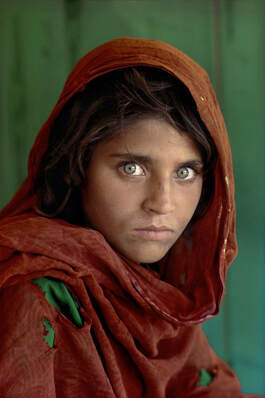 Perhaps one of the most iconic photographs in history, Steve McCurry’s “Afghan Girl” balances opposing emotions simultaneously. Knowing the context behind the image (it was taken at a refugee camp), we know that the girl’s surroundings are bleak. Though she is a young girl, we can see that she has had to grow up fast in her environment, and the ripped clothing and dirt smudges hint at a rough upbringing. The emotion of the photograph is one of rawness, realness, and using the Plutchik emotion wheel, sadness and grief. But the brightness of her green eyes has made an impression on people around the world who have seen this image - our emotion is amazement. The vibrancy of the colors in this photograph almost seem to betray the actual mood of the story behind the photograph. Jerry Cao writes in his article “Web design color theory: how to create the right emotions with color in web design” that the color red tends to symbolize power and youth. He says, green, on the other hand, “bridges the gap between warm and cool colors, though tends to be more of a cool color. This means green has the same relaxing effects of blue but still retains some of the energizing qualities of yellow.” Bibliography Cao, J. (2015). Web design color theory: how to create the right emotions with color in web design. Retrieved September 7, 2019, from https://thenextweb.com/dd/2015/04/07/how-to-create-the-right-emotions-with-color-in-web-design/ Lupton, E. (2017). Design is Storytelling (p. 61-65). New York, NY: Cooper Hewitt. McCurry, S. (Photographer). (1985) Afghan Girl [photo] Norman, D. A., & Ortony, A. (2003). Designers and Users: Two Perspectives on Emotion and Design. Retrieved September 7, 2019, from http://projectsfinal.interactionivrea.org/2004-2005/SYMPOSIUM%202005/communication%20material/DESIGNERS%20AND%20USERS_Norman.pdf Gatiss, M., Moffat, S., Thompson, S., Vertue, S., McGuigan, P., Lyn, E., Lawes, S., ... Public Broadcasting Service (U.S.),. (2010). Sherlock: Season three. Zeffirelli, F., Shakespeare, W., & Paramount Home Video (Firma Comercial : Estados Unidos). (1968). Romeo and Juliet. Hollywood, CA: Paramount Home Video .During arguments with a boyfriend, girlfriend, friend groups, and parents, it’s easy for emotions to escalate in the heat of the moment. We often use phrases like “We’re not arguing; we’re having a heated discussion!” or “I’m not mad, just disappointed,” or “I’m not being defensive; I’m upset!” to prove that the emotions we seem to be conveying in the way we talk or act are not the emotions we actually feel. More often than not, however, we are in fact arguing, mad, or being defensive. But other times, it could be the emotions that we do feel are simply extensions of rage, terror, amazement, ecstasy and other feelings. This is how prominent psychologist Robert Plutchik came to create a map of human emotions inspired by the color theory, according to Ellen Lupton, author of “Design is Storytelling.” Lupton writes: “He identified eight primary emotions, whose gradations and overlaps create dozens of variants....Each primary emotion varies in intensity, from ‘loathing’ or ‘ecstasy’ (extreme) to ‘boredom’ or ‘serenity’ (mild). Primary emotions mix to create secondary ones” (Ellen Lupton, 2017, p. 61). In other words, we might mistakenly assume that someone’s facial expression indicates loathing or disgust when in reality, he or she is just bored. Likewise, someone who appears unusually interested in something may be exercising healthy caution. Coming from a bit of a marketing background, I can confidently say that being able to create compelling imagery that makes audiences want to invest their time and money into products relies heavily on being able to make them feel a certain way. Perfume and cologne commercials are often seductive in nature in hopes of making viewers feel that with that particular brand of fragrance, they too can feel powerful; a force to be reckoned with. And many of the anti-smoking ads I see evoke feelings of sadness and sympathy when the subject of the ad has clearly suffered from the after-effects of smoking. Ekaterina Walter and Jessica Gioglio, co-authors of “The Power of Visual Storytelling: How to Use Visuals, Videos, and Social Media to Market Your Brand” accurately sum up the importance of empathizing with audiences in marketing: “Empathizing in the intended way to symbols and images is reliant on a shared cultural identity - that is, on an understanding of who your audience is...Whereas images such as star-spangled flags and eagles can appeal to an American sense of patriotism, the same effect may be achieved by a maple leaf, a lion, or a kangaroo in other countries. And what appears strong and decisive to one audience could seem aggressive to another” (Gioglio and Walter, 2014, p. 17). Another important design theory to consider when identifying the emotions conveyed in imagery is Gestalt’s 5 principles of visual perception - Proximity, Similarity, Common Fate, Figure/Ground Ambiguity, and Closure and Continuation. In short, Proximity has to do with figures positions closely together to form groups; Similarity exists, depending on whether or not certain elements share the same color and shape; Common Fate refers to elements within a group changing or evolving together, Figure/Ground Ambiguity refers to white space being used either has a foreground or background, and Closure/Continuation happens when we the viewers automatically and mentally close empty spaces and gaps between shapes (Lupton, 128). Carolann Bonner, author of Thoughtbot’s “Using Gestalt Principles for Natural Interactions,” muses that the Gestalt principles are relevant to our understanding of visual imagery because they cement the idea that the image as a whole is more critical for our understanding than the individual parts that make up the image (Bonner, 2019). Similarly, Laura Busche iterates this point on design app Canva’s blog, writing “...processes like perception, learning, and cognition weren’t that simple, and couldn’t be understood by splitting them in parts. Instead, Gestalt psychologists were interested in complex ideas like insight, holism, and problem-solving…” (Busche). In the spirit of striving to better understand the emotions behind visual stories, I’ve selected the following images that I feel best represent the 3 varying intensities of the same emotion; Contempt. Annoyance:  The way Winona Ryder’s character Veronica’s face is positioned is almost her signature look throughout the movie “Heathers.” The downturned mouth, closed off body language, and the intense yet removed look in her eyes seem to point to annoyance. But her face alone isn’t the only visual representation of her annoyance. The three Heathers clearly think whatever they’re watching is an entertaining sight while Veronica visibly looks as though she’s had enough. Gestalt comes into play, as we can see that Veronica is not huddling close to the three other girls - there is a slight lack of proximity. In other words, she’s not part of the group (or doesn’t want to be), even though it looks like she is. And perhaps this is reading too much into it, but the dark, solemn colors Veronica wears in contrast with her friends’ outfits separates her from the pack, maybe a small indication that she’s starting to distance herself from the Heathers. Anger:  I don’t like that this image is called “Triggered Feminist Meme,” but this photo does do an effective job of conveying the emotion of anger. Unlike the “Annoyance” image above, there is more facial expression in the woman’s face. She looks as though she has some strong words to say to the man in the photo, we can see the strained muscles in her neck, and her eyes are widened in intensity - we can even see most of the whites in her eyes. The people behind her look relatively calm in comparison. I wouldn’t necessarily say that the woman’s reddish shirt somehow adds to the overall feelings derived from the photo. I feel that it is more coincidental than anything that the woman is wearing a shade of red/orange typically associated with fiery emotions. It’s also clear that she’s participating in some sort of protest - typically, the mood of people who are protesting is one of anger, or desperation at the very least. Protests are usually fueled by the desire for change, and anger because that change hasn’t happened yet. The Gestalt principle of proximity is again applicable here. The women are all part of their own group, while the man in the photo is an outsider. Rage:  “Rage” and “anger” are words that are often used synonymously, but the key difference between Gandalf’s rage and the anger conveyed in the picture above is that Gandalf’s body is in a ‘rage position;’ he is not just angry. His arms are lifted high, ready to attack if necessary, the lines in his forehead are furrowed deep, and the orange hues in the image all add to the visual of rage. Bibliography Bonner, C. (2019). Using Gestalt Principles for Natural Interactions. Retrieved September 7, 2019, from https://thoughtbot.com/blog/gestalt-principles Busche, L. Simplicity, symmetry and more: Gestalt theory and the design principles it gave birth to. Retrieved September 7, 2019, from https://thoughtbot.com/blog/gestalt-principles Gioglio, J., & Walter, E. (2014). The Power of Visual Storytelling: How to Use Visuals, Videos, and Social Media to Market Your Brand (1st ed., pp. 17). New York: McGraw Hill. Osborne, B., Jackson, P., Walsh, F., Shore, H., Wood, E., McKellen, I., Tyler, L., ... New Line Home Entertainment (Firm). (2002). The Lord of the Rings. United States: New Line Home Entertainment. Lupton, E. (2017). Design is Storytelling (p. 61-128).. New York, NY: Cooper Hewitt. Triggered Feminist [Digital image]. (2016). Retrieved September 4, 2019, from https://knowyourmeme.com/memes/triggered-feminist--2 Waters, D., Di, N. D., Lehmann, M., Ryder, W., Slater, C., Doherty, S., Falk, L., ... Anchor Bay Entertainment, Inc.,. (2008). Heathers. Burbank, Calif: Anchor Bay Entertainment. Photography, art, and illustrations, much like music, have the ability to play to our emotions or even instill feelings that hadn’t been there before. For example, listening to the mellow beats of Fleetwood Mac during the middle of a hectic workday has the power to calm my nerves and bring a sense of inner peace that I thought didn’t exist. Likewise, seeing any form of street art by the artist Banksy can instill feelings of anger, amusement, and sympathy depending on what message he tries to convey in his work. In other words, these small examples help demonstrate the power of visual storytelling. Nichole Elizabeth DeMeré, a writer for Hubspot, describes visual storytelling as “passing on a lot of information through a relatively simple visual aid,” a concept that has been used time and time again for marketing purposes. DeMeré continues, “Perhaps, if anything has changed, it’s what we want from life. That’s where today’s visual storytellers have a chance to not only say ‘Hey, you can get this here!’ but also lead the consumer into a whole new world of possibilities.” A straightforward commercial for a Google video chat feature can suddenly make us feel nostalgia or create a hunger for companionship, while a sports-oriented Tampax ad can make women feel like we can - and will - do anything to succeed. But it’s a great responsibility for artists and other creators to know what story it is they want to share. Bo Bergstrom, author of “Essentials of Visual Communication” writes, “Whatever the medium and storytelling technique, the important thing is always to get the audience involved in the story...The storytelling perspective is crucial in determining how a story is received, steering both text and picture composition” (Bergstrom, 2008, pp. 26). This is what Bergstrom refers to as “horizontal storytelling;” or the idea that the shared, common experiences between an image’s creator and his or her audience creates some level of mutual understanding. Ultimately when it comes to imagery, we can make assumptions about the artist’s intent while the creator may have had a different interpretation all along. However, by using visual clues, we can perhaps inch closer to what the creator hoped to convey. Below, I’ve included a few images that tell a story, even though the entire story may not be included in the frames: 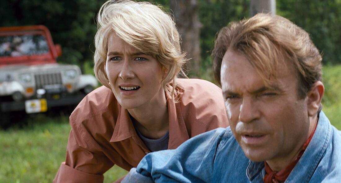 1. “Jurassic Park” Aside from the fact that everyone who has seen the “Jurassic Park” films knows how the movie starts and ends, we have some visual cues that tell us what is to come. Both characters’ eyes are zeroed in on something in the distance (dinosaurs, of course!) and their mouth expressions are positioned in awe. But I also noticed that the two characters aren’t necessarily smiling. While their faces clearly evoke feelings of wonder and amazement, it is almost as if they know (as the audience certainly does) that this great power they’re beholding is also capable of great destruction. However, the bright colors that play off the page, along with the lush green in the background offer a sense of serenity and safety - for now.  2. “The Shining” “Heeeeeere’s Johnny!” We can tell by the jagged parts of the door that this man (I’m assuming his name is Johnny? I’ve never actually seen “The Shining”) has broken into a place he has no business being. And of course, the menacing way his teeth are clenched and the way his eyes are looking wildly in one direction indicate that he’s the hunter, keeping a watchful eye on his prey. The sweat glistening on his forehead also hint that this is something he has been pursuing for awhile. “The Shining” arguably utilizes the storytelling strategy that Bergstrom describes as “dramaturgy.” He writes, “Dramaturgy means the art of telling a story so captivatingly that the audience has to follow the story right to the end” (Bergstrom, pp. 27). More specifically, from my knowledge, this film incorporates the use of the dramatic technique, which focuses on the “dramatic triangle” - the pursuit between the victim, their attacker, and the hero. In this case, “Johnny” is the persecutor.  3. “Freedom From Want” by Norman Rockwell The title of the painting is a fitting one. There’s a sense of anticipation in the family’s face as the turkey is set down on the table, particularly for the little girl sitting at the end of the table. We can also tell that this is an upper-middle class family, based on the table settings perhaps even the size of the Thanksgiving dinner. The turkey is the focal point of the image, as there seems to be an invisible line that moves the eye towards the end of the table. The use of cool, calm colors helps set the tone of the painting, as do the jovial faces of all those present. I think it is perhaps most interesting that typical autumn-themed colors (i.e. red, orange, browns, etc.) are not used to highlight the fact that the holiday is Thanksgiving. In my opinion, this challenges viewers to reflect on the celebration conveyed more closely. Perhaps it is the joy of being with family, versus the size of the turkey, that adds to the happy mood of the painting.  4. “I Want YOU!” by James Montgomery Flagg In the introduction to “Visual Storytelling,” Andrew Losowsky argues that the goal of visual storytellers is to marry viewers’ emotional reactions with the narrative context we are given. He states, “The colors, typography, style, balance, format of an image will generate that first instinctive smile or frown, attracting or repelling the gaze for reasons we don’t fully understand; only if the reader’s instincts are sufficiently encouraged to continue focusing on the visual stimuli…” (Losowsky, 2011, pp. 1). Such is the case with this particular image; we as the viewers are expected to immediately capture the wartime patriotism presented. As is the aim of the poster art, Uncle Sam looks intently at the viewer, the objective being to recruit young men to enlist. The intent look in his eyes, the strength of his finger-pointing, and the emphasis of the red, white, and blue colors evoke a strong sense of patriotism and desperation as the U.S. becomes more and more involved in WWII. 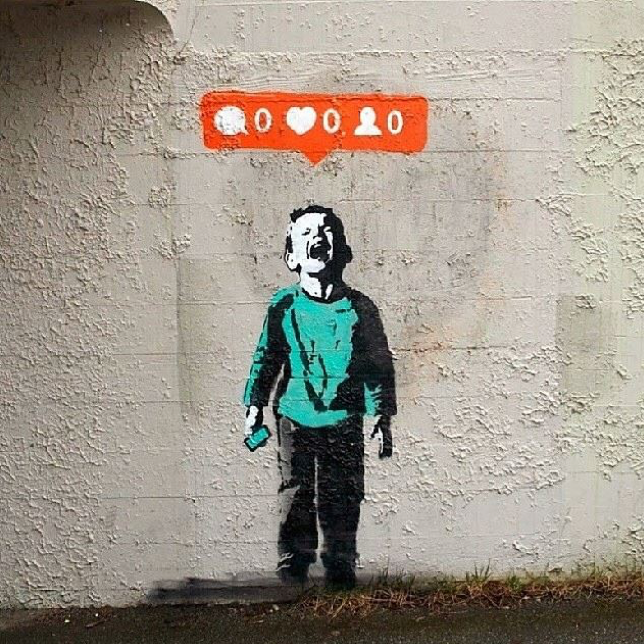 5. “Nobody Likes Me” by IHeart If this were a painting of just the crying child, we’d feel a sense of sadness and even empathy for him based on his facial expression. However, the orange like, comment, and follower request bar overhead shows just what the child is upset over - lack of validation from his peers on social media. The bright colors of his turquoise shirt and the Instagram draw attention to the image as a whole. In Uta Russmann and Jakob Svensson’s report “Introduction to Visual Communication in the Age of Social Media: Conceptual, Theoretical and Methodological Challenges,” they touch upon the theme of visuals as forms of commodity and validation: “...given that social media platforms are the prime locus for sociability - at least among young people in the West - this shift towards visuals arguably transforms how we relate to each other and the world around us, as well as how we perceive and construct our sense of self” (Russmann and Svensson, 2017, pp. 1). Especially on visual-heavy social networking platforms like Instagram, the feeling we may get from this image is one of relatability. 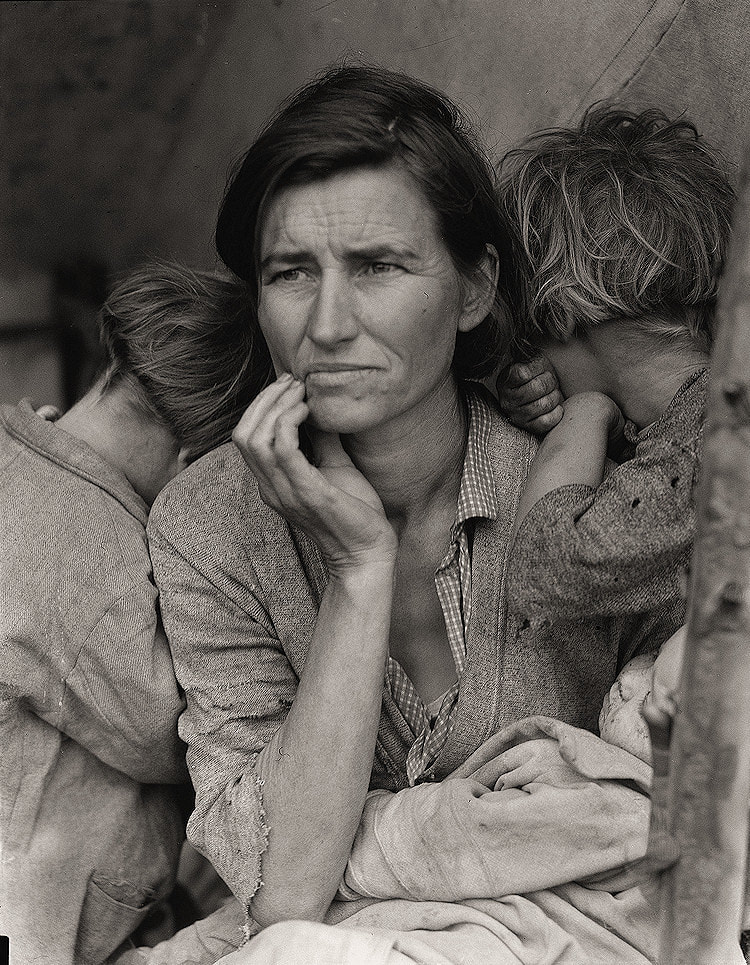 6. “Migrant Mother” by Dorthea Lange Losowsky writes that “More than half our brains is dedicated to the processing of visual input, and so pure text and numbers simply cannot convey information in as memorable or digestible a form as that of successful visual-based storytelling” (Losowsky, pp. 1). This may be a reason why this is one of the most iconic photographs depicting the Great Depression. In it, Lange captures the sense of desperation and desolation in the mother’s face and hand position, as well as the overall sadness her children feel as they bury their heads in their mother’s shoulders. The lack of color, which was common not to have in photos at the time, add to the hopelessness. What will happen next? The subjects in the photo seem to find difficulty in answering that.  7. “Stop” by The Spice Girls The dreary, neutral colors of the English town that’s being used as the backdrop of The Spice Girls’ music video is offset by the vibrant colors of the women’s clothing and their happy-go-lucky dance movements. It’s not totally clear what is to come just by looking at this image, but using the aforementioned visual clues, we know that this sight is not typical for this environment.  8. “Stranger Things” The blood dripping down from Eleven’s nose tells us that something bad is about to happen, possibly caused by her. Her shaved head, which would probably be perceived as unusual in the town she’s in, combined with the semi-normal clothes she dons, as well as the intense facial expression she wears tells us that she’s a foreigner and someone who’s seeking vengeance. Much like the “Jurassic Park” example, we’re drawn to the drama in the storytelling. Those who know the series know she is the victim in her own “dramatic triangle.” The intensity of the situation is magnified when we observe the small bit of blood dripping from her nose. 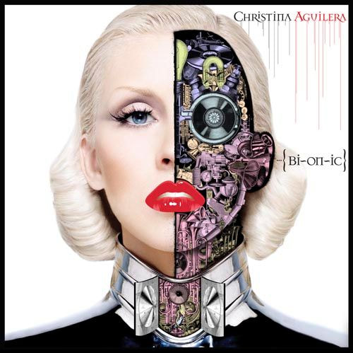 9. “Bionic” Christina Aguilera album cover I would like to think that Christina Aguilera’s 2010 album cover is supposed to represent the duality of being a woman - for her, it may mean representing classically feminine qualities (left side) while keeping her more hardcore, rough-around-the-edges side hidden under her skin (right side). On one side, she looks neutral and “normal” but on the other, we can see that there’s something else going on underneath the surface. Perhaps we can interpret this image as a possible product of social conditioning. The human side reflects everything that women feel we are supposed to be on the outside while the robotic side; the side that has learned to be calculated and not so vulnerable, represents the times we’ve forced ourselves to operate in a way that makes us feel safer and less prone to hurt.  10. “Lady with an Ermine” by Leonardo da Vinci
Most portrait paintings during da Vinci’s time showed the subject either in a forward facing position or side profile view. But in this painting, the artist ‘captures’ a more candid view of his subject. The subject’s attention (as well as the weird cat thing’s) may be focused on something else in the room - or another person, perhaps a lover, some historians have argued - but the soft lighting on her face enhances her overall beauty in a way that painting her head-on might not have emphasized as much. Bibliography Aguilera, Christina (2010). Bionic. [Recorded by Christina Aguilera] On Bionic (MP3 file]. RCA Records. Bergstrom, B. (2008). Essentials of Visual Communication (p. 26-27). London: Laurence King Publishing. DeMeré, N. (2015). The Power of Visual Storytelling: 15 Stunning Examples to Inspire You.. Retrieved September 12, 2019, from https://blog.hubspot.com/marketing/visual-storytelling-examples Duffer, M., Duffer, R., Ryder, W., Harbour, D., Wolfhard, F., Brown, M. B., Matarazzo, G., ... Netflix (Firm). (2017). Stranger things: Season 1. Flagg, J.M. (1917). I Want You. [Oil on canvas for posters]. Retrieved from https://www.loc.gov/item/93509735/. IHeart (2014). Nobody Likes Me. [Image] Retrieved from https://www.blazenfluff.com/banksy-style-street-art-shows-a-boy-crying-out-for-social-media-attention/4333 Kennedy, K., Molen, G. R., Spielberg, S., Crichton, M., Koepp, D., Neill, S., Dern, L., ... Amblin Entertainment (Film). (2000). Jurassic Park. Universal City, CA: Universal. Kubrick, S., King, S., Johnson, D., & Warner Bros. (1980). The Shining. Lange, Dorthea. (1936). Retrieved from Prints and Photographs Division. Library of Congress. Washington, D.C. Retrieved from http://www.loc.gov Leonardo, ., Grabski, J., Wałek, J., National Gallery of Art (U.S.), & Biblioteka Czartoryskich w Krakowie. (1991). Leonardo da Vinci, 1452-1519: Lady with an Ermine : from the Czartoryski Collection, National Museum, Cracow. Vienna: IRSA. Lokowsky, A. (2011). Visual Storytelling (p. 1). Berlin: Gestalten. Rockwell. N. (1943). Freedom from want. [Oil on canvas for posters]. Artstor. Retrieved from http://library.artstor.org/#/asset/ARTSTOR_103_41822000958361 Russmann, U., & Svensson, J. (2017). Introduction to Visual Communication in the Age of Social Media: Conceptual, Theoretical and Methodological Challenges. Media and Communication, 5(4), 1–5. doi: 10/17645/Mac.v5i4.1263 Stop. (1998). [video] Directed by J. Brown. Dublin: Virgin Records. |
 RSS Feed
