 RSS Feed
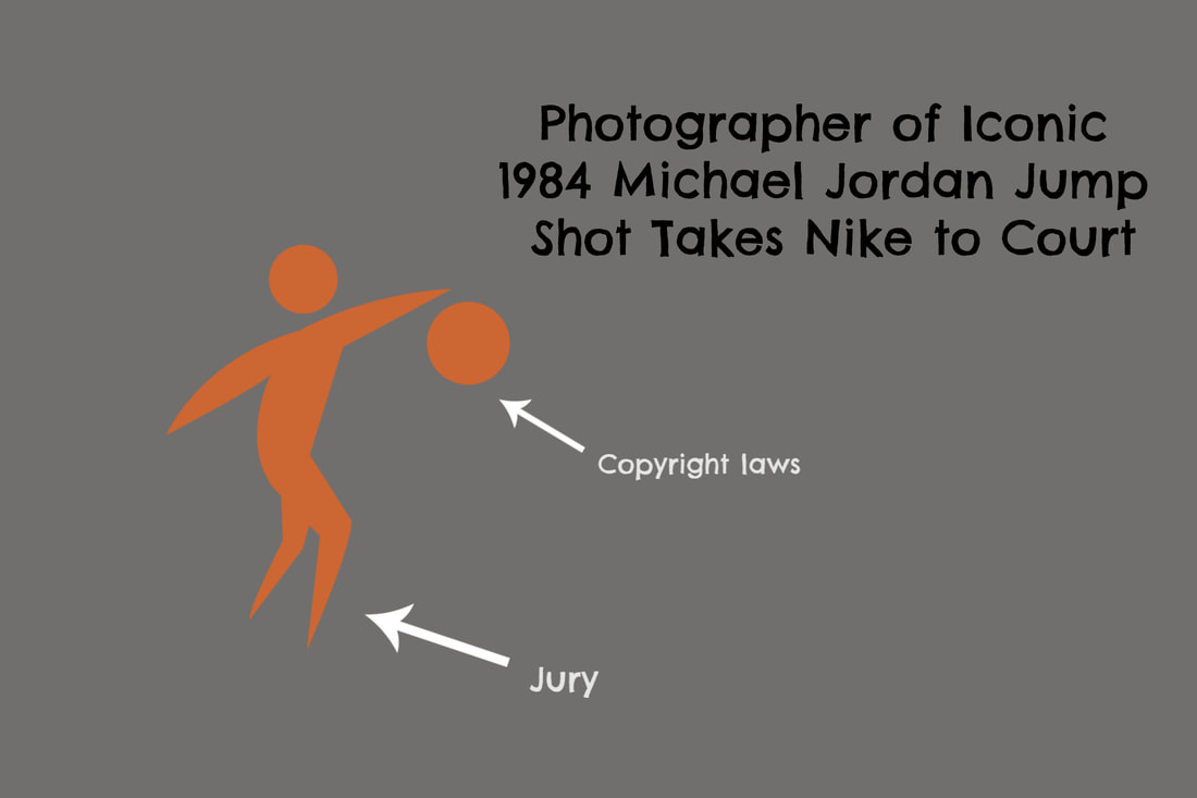 Since the advent of photography as an art form, photographers have fought relentlessly to have their work taken as seriously as other types of artists’. And as technology has advanced over the last several decades, allowing photographers and digital/graphic artists to edit and manipulate their work into something that might be considered iconic, copyright laws have taken shape to better protect the creators of some of our favorite art and logos. One such case occurred in 2015 when photographer Jacobus Rentmeester accused Nike of manipulating his image of Michael Jordan in a wide-stance jump to use for its famous ‘Jumpman’ Air Jordan logo (Kyle Jahner, 2018). The full article can be found on Bloomberg Law, but here is a short recap of the case: Rentmeester’s original photograph was used in the 1984 issue of the now-defunct Life Magazine (pictured below), however, he claimed that he was owed copyright protection because he felt Nike’s Air Jordan logo made just a few alterations to his photo that is now widely known as one of Nike’s most famous graphics (also pictured below). 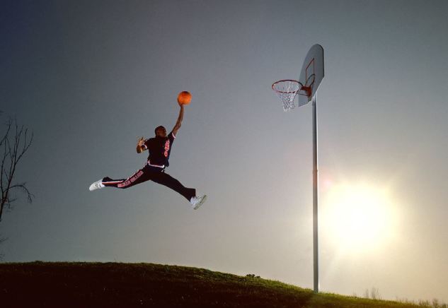 Jacob Rentmeester image found on Bloomberg Law website 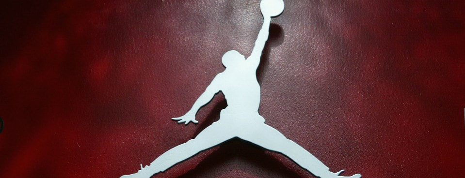 Christian Petersen/Getty Images Rentmeester claims that besides using his original image to create the Jumpman silhouette logo, Nike used their version of his photograph for ad campaign/marketing purposes - specifically surrounding the launch of Nike’s Air Jordans (Jahner, 2018). And while the photographer said that Nike did give him a two-year, $15,000 payment in exchange for being able to use a manipulated version of his original photo for signs, posters, billboards and other marketing collateral in the North American market, Rentmeester claims that Nike used the image for marketing beyond the parameters of their original agreement.
In the end, the U.S. Court of Appeals for the Ninth Circuit dismissed Rentmeester’s lawsuit, stating that there were enough differences between his photograph and Nike’s Jumpman logo to put the case to rest. Kyle Jahner, the article’s author, states that this case could set a precedent clarifying if and when characteristics in certain photographs are warranted the same copyright protections as other art forms, such as music and paintings. Essentially, it will be up to the court to decide how ‘substantially similar’ the elements of an image are to an original photograph to be considered copyright infringement (Jahner, 2018). It’s a challenge to say whether or not Nike ‘ripped off’ Jacobus Rentmeester’s photograph for their own benefit, especially when there’s no definitive proof that this was Nike’s intent. I also think there’s a danger in creating a black-and-white precedent for every art-related copyright lawsuit since every case is so unique and because there’s no way of truly knowing whether an artist used another artist’s work to pass off as his/her own, or if they simple drew inspiration from the original work. Additionally, if it’s up to the juries to decide whether or not copyright laws have been violated, there’s a good chance these types of lawsuits will increase in number, become much more drawn out, and further restrictions will be placed on future artists’ work. By now, I imagine most photographers and artists realize the importance of getting the proper copyright and licensing for their work but this won’t always help clear the muddied waters of cases such as the Nike vs. Rentmeester one. The general rule of thumb is that in the case of photography, it’s the one who clicks the button that owns the copyright on that image. But with Nike, there may have been some ‘work-made-for-hire’ circumstances that caused contention between the two parties. After having read some commonly asked copyright law questions on photographer Ken Kaminesky’s blog, it may be that Nike’s Jumpman logo could be considered a derivative work (although it’s doubtful Nike would admit this). Kaminesky defines a derivative work as “different enough from the original to be regarded as a new work - in other words, it must contain some substantial, not merely trivial, originality. The threshold for originality in a derivative work is higher than that required for the original work.” In conclusion, I might agree that Rentmeester’s Michael Jordan photo is oddly similar to that of the Nike Jumpman graphic, but there’s no way to definitively say that Nike ‘stole’ the image. There are several substantial differences between the photograph and Nike’s Jumpman logo - namely the photographic quality, the landscape background, and Jordan’s leg position - to where I believe the court made the best ruling considering the evidence they were given. In a world where original content and original artwork can be so quickly put on display and disseminated to large amounts of people at once, it’ll become that much harder to say with all confidence what is truly an original work and what isn’t. But as long as artists from all mediums take care to copyright their work, attribute credit where it is due, and make their work their own, they likely won’t find themselves battling big corporations in court. Bibliography Jahner, K. (2018). Nike 'Jumpman' Logo Takes Center Court in Photo Copyright Fight. Retrieved February 16, 2019, from https://news.bloomberglaw.com/ip-law/nike-jumpman-logo-takes-center-court-in-photo-copyright-fight Kaminesky, K. Photography and Copyright Law. Retrieved February 16, 2019, from https://blog.kenkaminesky.com/photography-copyright-and-the-law/
0 Comments
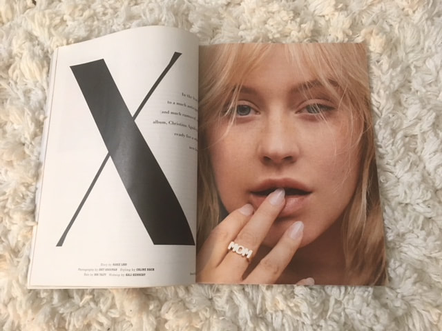 For this week’s assignment, I compare the web version of the Spring 2018 edition of PAPER Magazine with the physical hard-copy. Here is the cover page of the paper PAPER magazine: 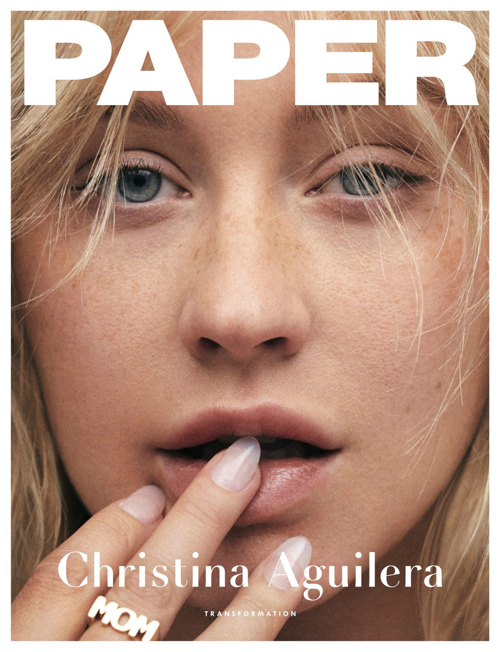 Image by PAPER Magazine The cover story has to do with (yet another?) artistic transformation of the singer-songwriter Christina Aguilera. Her au natural face comprises the entire front cover, save for the tiny white margins. There are no other magazine stories highlighted on the cover; the word “PAPER” is superpositioned over her forehead and her name is holding down the fort at the bottom edge of the magazine. If you proceed to page 26 where her story begins, a very modern font is used for the letter “X” (often used to denote Aguilera’s name; “Xtina”) while the rest of the story uses a thick sans serif font (save for the pull-quotes that utilize the modern font again). Additionally, it appears that the tracking across all the words makes them appear more spread out with plenty of space separating each word. From page 26 to where her story ends at page 40, the layout utilizes a two-column format (at least on the pages where various images of the musician aren’t covering entire pages). However, it is important to note that while the two-column format is used, there aren’t alway words appearing in both columns, and the words appear to be left-justified with no indents. In fact, the article leaves almost half-pages empty, leaving some of the pull-quotes to hang in the air and make more of an impression on readers. Although I might not have thought of laying out the design in this way, I think it is a good use of white space. This strategy follows one of the layout rules Kim Golombisky and Rebecca Hagen outline in Chapter 4 of the book “White Space Is Not Your Enemy.” They describe “trapped space” to a trapped bubble that can’t escape, (Golombisky and Hagen, 2017, p. 40) however, the designers behind PAPER Magazine avoid this by pushing the extra negative space to the outside of the layout. 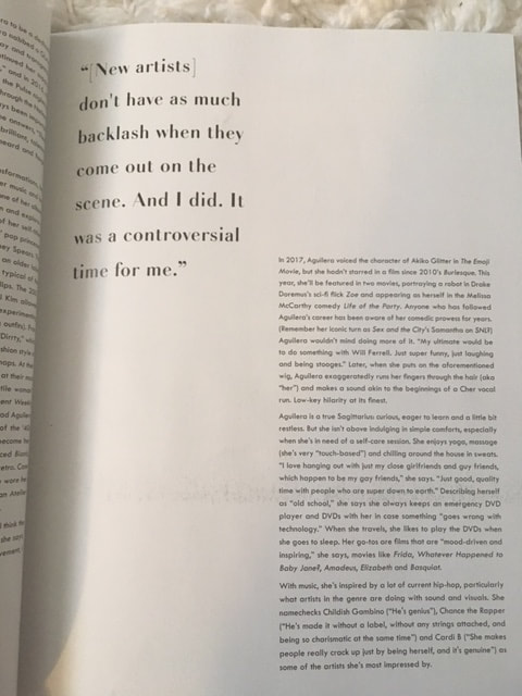 The web version of PAPER Magazine, however, uses a different kind of font, a more web-friendly font that is a bit easier on the eyes - Lato. And rather than a modern type of font being used to denote significant quotes or aspects of the cover story, a boldened/thicker Sans Serif font is used (link here so readers can follow along: http://www.papermag.com/christina-aguilera-transformation-2553214651.html). 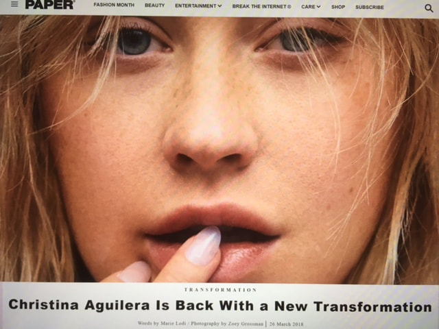 Unlike the paper version of the story, Xtina’s full face isn’t featured right away; it’s partly cut off by words where the story begins (although if you scroll down a bit, a screenshot of the paper cover appears in the article). The web version lays out the story in one column and like the magazine version, everything is left-justified with no indents. The pull-quotes, however, are centered. One of the other main differences is that the web version allows viewers to choose what images of Xtina they want to enlarge since all the images don’t appear in their full size as they do in the physical copy.
Bibliography: Golombisky, K., & Hagen, R. (2017). Layout Sins. White Space Is Not Your Enemy: A Beginner's Guide to Communicating Visually Through Graphic, Web & Multimedia Design (3rd ed., pp. 33-44). Boca Raton: Taylor & Francis. Lodi, M. (2018). Christina Aguilera Is Back With a New Transformation. Retrieved February 9, 2019, from http://www.papermag.com/christina-aguilera-transformation-2553214651.html Lodi, M. (2018), Christina Aguilera Transformation. Paper, 34, 26-40. 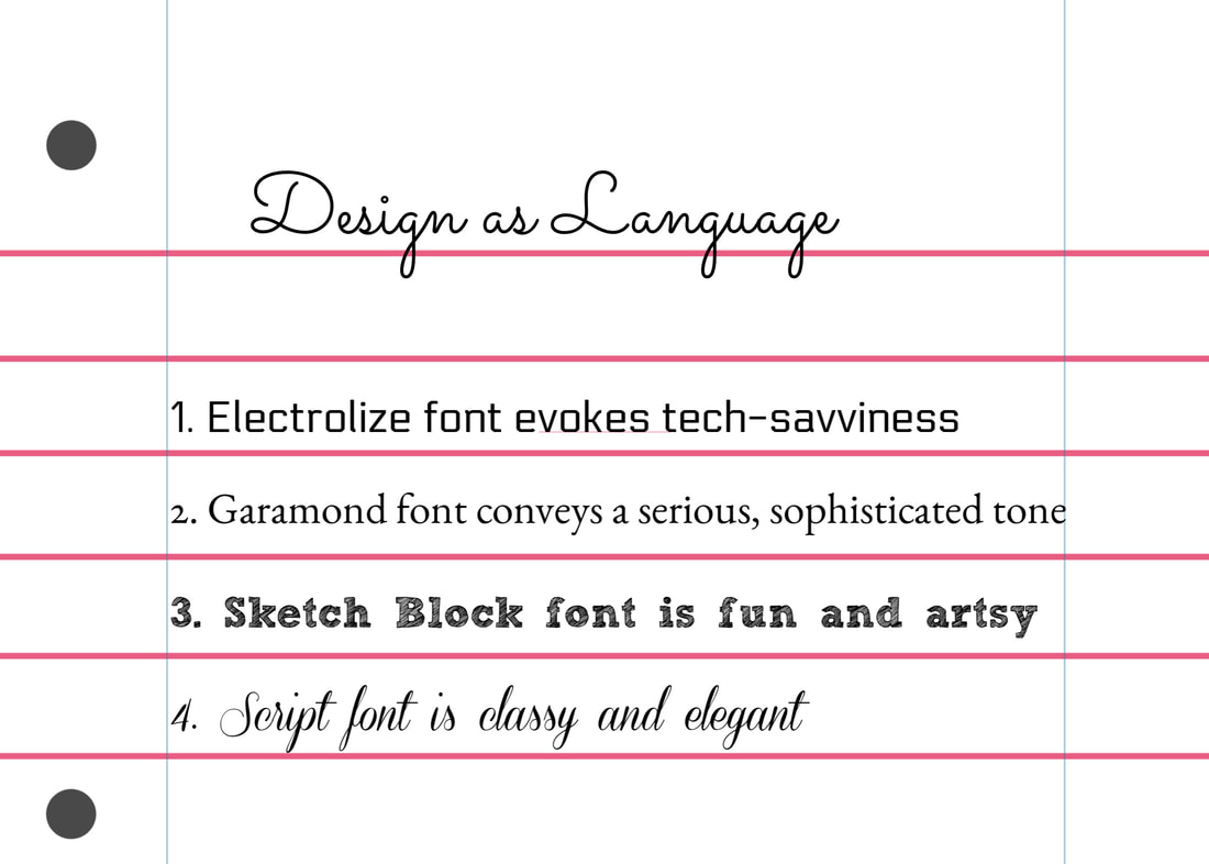 In any culture where language is communicated via writing, we know that understanding takes place when one knows the meaning behind each symbol. In English, the “A” shape notes the beginning sounds of words like “apple,” “adolescence,” and “aptitude;” in Hebrew the chai symbol (the one that looks like pi) denotes “life,” and we know from our basic understanding of ancient Egyptians, much of their written communication we see in hieroglyphics.
Through my reading and hands-on work in Module 2, I’ve come to better appreciate and understand design as a language as well. It is up the the designer to use their art tools and knowledge of design principles to effectively communicate their message and it is also up to the viewer to understand what is being said through an image. In the Printing Code article “Basic Shapes and Relationships,” the author uses the word “Danger” as an example for how the illustration of this word can be manipulated to mean different things. When the word “Danger” is written in Comic Sans text in a bright color (one that isn’t red), it might be difficult for someone to take the word “Danger” seriously. It is for this reason that our U.S. stop signs are colored in red and the word “STOP” is written in all caps -- the red color tends to stand out from the usual color of our surroundings (i.e. green trees and grass, and the dark color of the road ahead), causing our brains to pay attention to the brightly-colored traffic sign. Even rudimentary stick figures placed on signs warning drivers to look out for cyclists and pedestrians stand out in our brains, quickly capturing our attention and reminding us that we’re not the only ones using the road. Even the placement of shapes can convey a message about a design. A shape that is tilted, seemingly hanging in the air can come across as whimsical, while a solid-colored image placed at the bottom of a canvas might be deemed more serious. An image with distinguishing features that is placed where it stands out from the other objects may make it the focal point of a design, while an object placed in a more hidden area might be interpreted as a supporting character of sorts. These principles are true of a design’s text as well. In the textbook “White Space is Not Your Enemy” by Rebecca Hagen and Kim Golombisky, the lines that comprise text/font convey personality. The authors write, “...the line is associated with movement and eye flow. And, if we recognize that a layout in its entirety forms a unified picture of sorts, when we also can use lines in layout to control the eye’s movement in order to convey information, as well as evoke emotion” (Golombisky and Hagen, 2017, p. 48). Some popular text fonts that come to mind as I ponder this principle are fonts like Bookman Old Style or Garamond, which tend to evoke a sense of high intelligence and literacy. Handwriting or script style fonts are elegant, while Comic Sans seems more cartoonish (and is often the butt of many writers’/creative people’s font jokes). All this is to say that just as form follows function, the elements of design - space, line, shape/form, size, color, texture, focal point, contrast, balance, unity, pattern, movement, proximity, closure, continuity and so forth (Golombisky and Hagen, 2017, p. 46) - must convey the correct message. Both the image and the distinguishing features of an image must be consistent with the designer’s overall goal. Bibliography: Basic Shapes and Relationships. Retrieved February 2, 2019, from http://printingcode.runemadsen.com/lecture-form/ Golombisky, K., & Hagen, R. (2017). Mini Art School. White Space Is Not Your Enemy: A Beginner's Guide to Communicating Visually Through Graphic, Web & Multimedia Design (3rd ed., pp. 46-48). Boca Raton: Taylor & Francis. 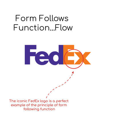 Visual designers, architects, home and fashion designers, and graphic artists are constantly challenged to create works that follow the mantra “Form follows function.” For many people outside these design fields, there seems to be a greater emphasis placed on the creativity and aesthetics that go into a design project, rather than the purpose of the art. Up until last fall, when I began taking on some basic design assignments at my workplace and up until I began taking 502 Visual Design through Quinnipiac University, I had this sort of mentality as well, that the overall look of a design has greater importance than its purpose. The basic premise of “form follows function” is that the art in question must have a well-defined function that meets the needs of whomever the art’s patron is. For example with the FedEx logo, we are already familiar with the iconic purple and orange letters that spell out the name of the company. But if you look closely at the “E” and “x,” there is a white arrow created by the closeness of both letters. The arrow, essentially a hidden figure, symbolizes the main function of the business - being a delivery service. The subtle placement of the white arrow is a clever and well-placed part of the design, but the logo’s designer did well to ensure that the name “FedEx” is the focal point. Rebecca Hagen and Kim Golombisky, authors of “White Space is Not Your Enemy” simplify the definition of the “form follows function” principle: “Good design results from a partnership between ‘form’ as art and ‘function’ as utility” (Golombisky and Hagen, 2017, p. 2). The rules of aesthetics will always change but the idea that art that is geared for architecture and business must have usefulness will be evergreen. However in his article “Form Follows Function - An unclear design principle,” Andreas Burghart challenges the idea that function is more important than form. While the form or the aesthetics of a design should not take precedence over its function, neither should function be considered greater than form. Burghart argues that the form and function of art should complement one another. As long as the aesthetics of a design don’t subtract value from the work, Burgart believes that the appearance of a design has the ability to convince viewers that the art is functional and influence certain emotions in viewers (this is especially useful in the marketing world). The author writes, “Aesthetic aspects like the look, feel, small, sound and taste of an object provide information about its function. Therefore, aesthetic features cannot only be leveraged to allow an object to look beautiful, but also to explain what it is and what you can do with it” (Burghart, 2012). Lastly, because design trends are changing all the time, it’s important to evaluate which ones adhere to “form follows function.” Tim Hopma’s 2016 Zazzle Media article “Web Design Trends for 2017” gives an overview of what trending design features (especially those geared towards websites) add to the value of a business or organization that adopts such trends. An example: web animations have become a popular way for business owners to show prospective customers how to use certain products, give a creative history of the company’s origins, and serve as a way to catch viewers’ eyes when they land on certain web pages. These animations have different purposes, Hopma writes, but what they have in common is functionality and the ability to give websites a bit of personality and storytelling appeal (Hopma, 2016). Bibliography: Burghart, A. (2012). Form Follows Function - an unclear design principle. Retrieved January 27, 2019, from https://www.centigrade.de/blog/en/article/form-follows-function-an-unclear-design-principle/ Hagen, R., & Golombisky, K. (2017). What is Design? Making Visuals & Type Play Nice in Space. White Space Is Not Your Enemy: A Beginner's Guide to Communicating Visually Through Graphic, Web & Multimedia Design (3rd ed., pp. 2). Boca Raton: Taylor & Francis. Hopma, T. (2016). Web Design Trends for 2017. Retrieved January 27, 2019, from https://www.zazzlemedia.co.uk/blog/digital-design-trends/#gref |
